Making your competitors jealous Giving your ideas the right shape
We create professional design for memorable customer experience Helping you present ideas in the most effective way
1SEC Launch
Express naming, core branding and product design for the company launch
Brand identity, Motion design, 3D modelling
Adobe Illustrator, Figma, Blender, AfterEffects
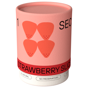
1SEC brings dehydrated fruits and meats right to your doorstep. By dehydrating meals, 1SEC can provide food without preservatives in a long-lasting format while preserving most of its nutritional value.
In this project, we thought of how to make every part of the customer journey - from ordering to snacking - unique and enjoyable. Our team provided 1SEC with naming, branding, packaging and web design - everything the company may need for the initial product launch to ensure a pleasant customer experience.
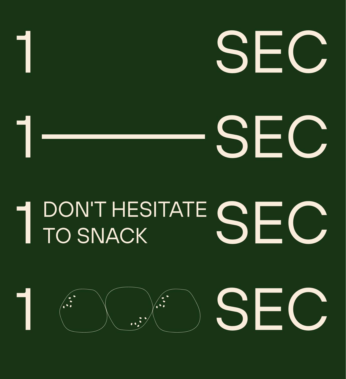
The first stage was to develop naming and core branding. The naming is a wordplay between French "sec", meaning "dry", and English "second", referencing the nature of fast snacks.
As the brand wants to appear modern and agile, we decided to make it layout-dynamic: its layout can change in different formats based on the context. The client was just at the launch phase and mentioned that the logo should be simple to use, and therefore, we went for a typography-based logo.
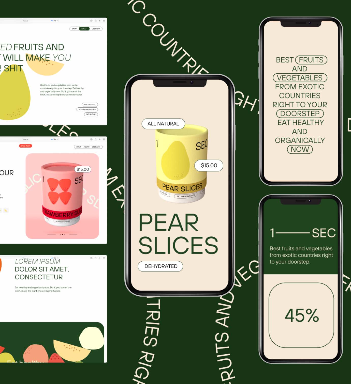
One of the core components of this project is web design. During a series of brainstorming sessions, we decided to follow a product drop model. While this model is usual in fashion, yet remains uncommon in food retail. In our case, using the drop sales model was incredibly logical: we wanted to keep the stock fresh with the seasonal fruits available to the customers, and we aimed to minimise any types of waste, including extra packaging or food waste. This way, customers could purchase in advance, and we would plan inventory to the last pre-order.
The website is fully centred around the product page. The product page provides several variations with the choice limited to the current drop offering. By having a product-centred web page, user engagement and retention is better integrated with socials.
It helps to set up marketing campaigns for product launches more efficiently, following the AIDA marketing principles: grab attention, build interest, create desire, trigger action.
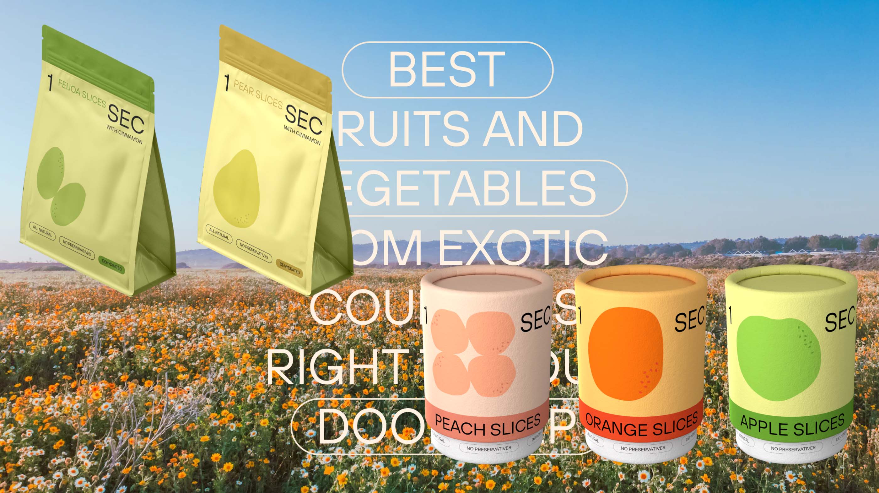
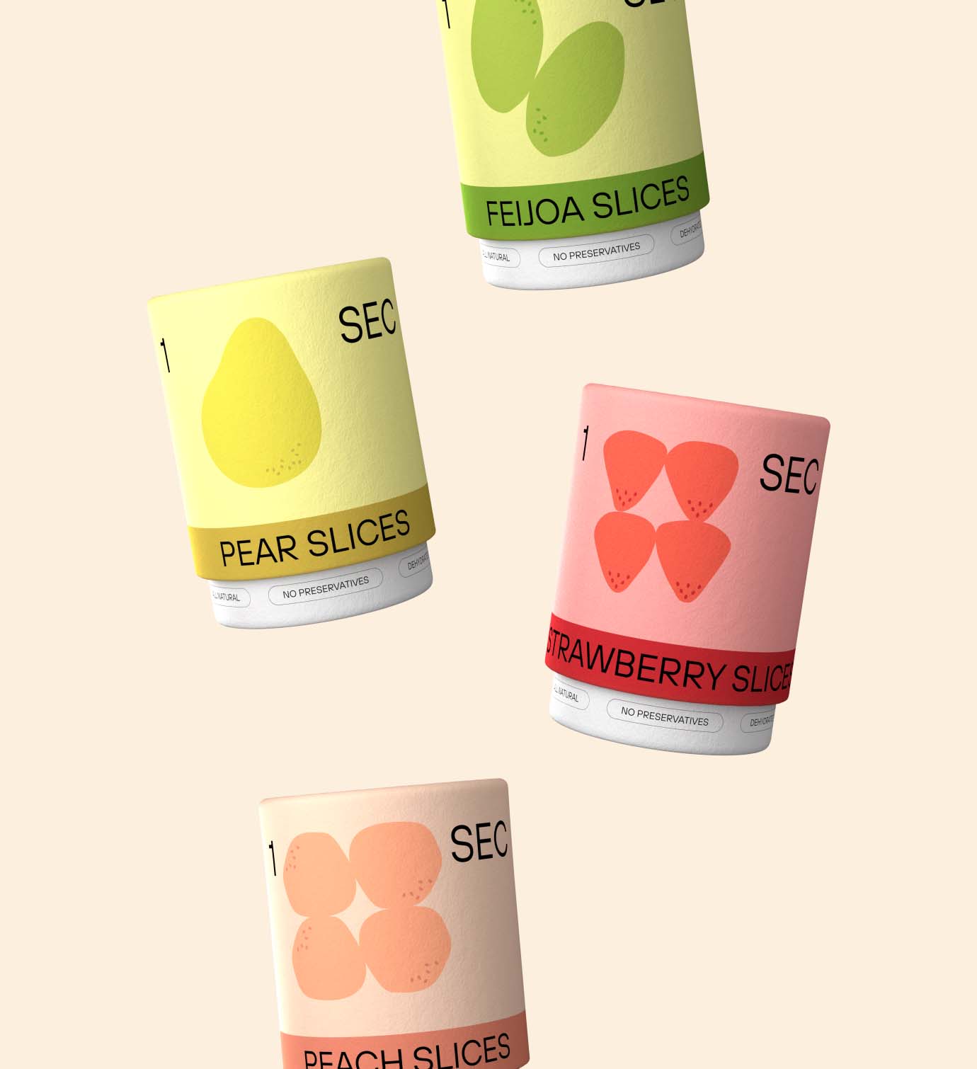
Product packaging was another integral part of the project. In our case, we came up with two packaging variations. Each variation aimed to optimise the client's budget, which is critical in the launch phase. At the same time, we made sure that there were no compromises made in terms of product customer experience.
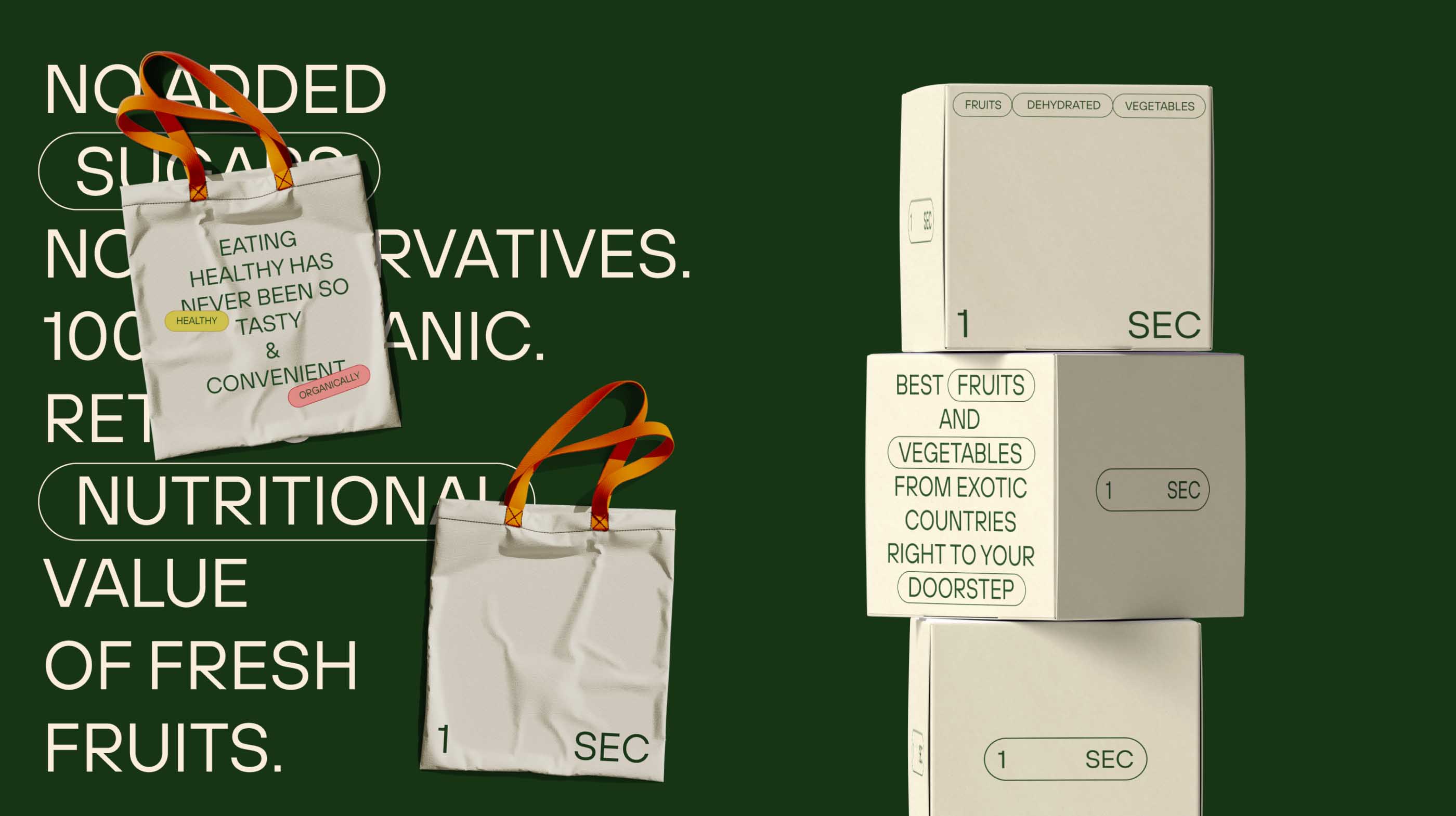
For 1SEC, we provided the utmost comprehensive solution as we created all the assets needed for the product launch saving the client a lot of time and money as some of the materials were designed as a part of our express design offering.
-
BRANDING & PACKAGING: Sasha Kurilenko
-
3D AND MOTION: Lena Sivakova
-
WEB-DESIGN: Ksenia Leonteva
-
NAMING: Egor Zmaznev
-
PROJECT FINISHED: 26.08.2022
-
TOTAL WORKING DAYS: 47
Other projects
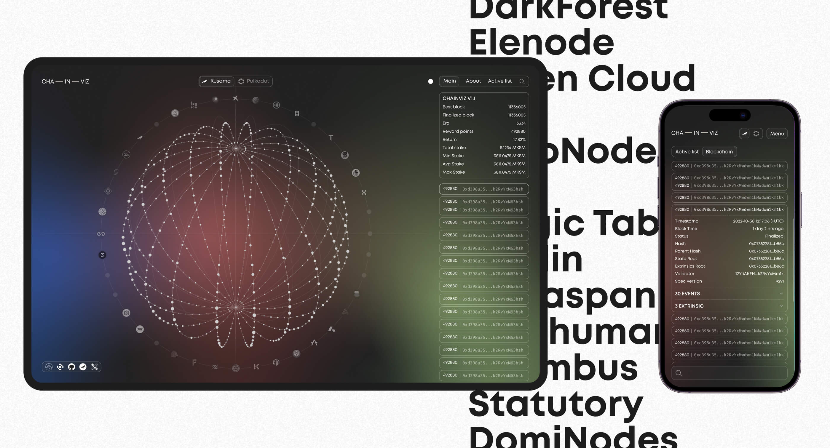
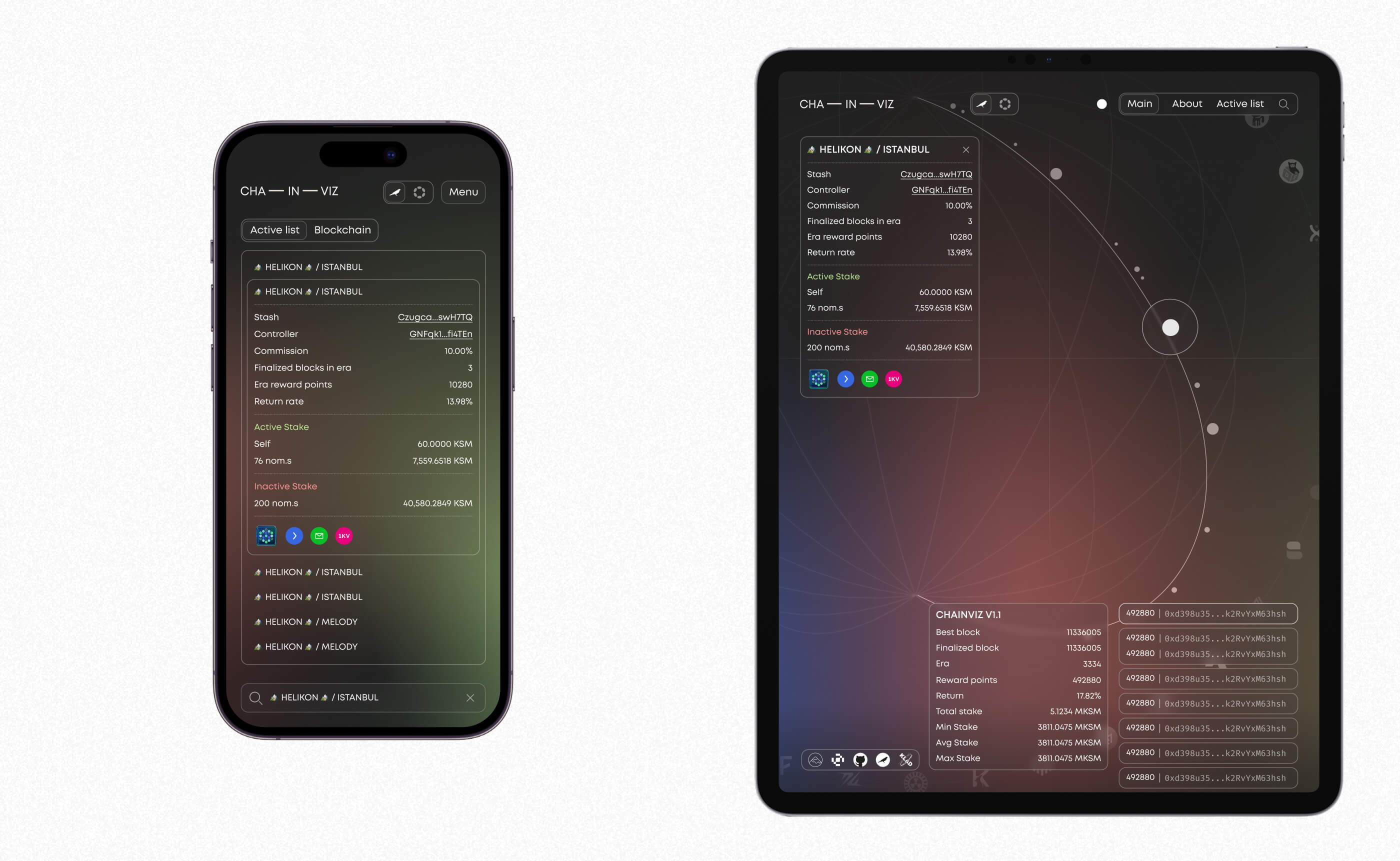
Chainviz Web App
Visualizing validator space with intuitive, responsive web app design
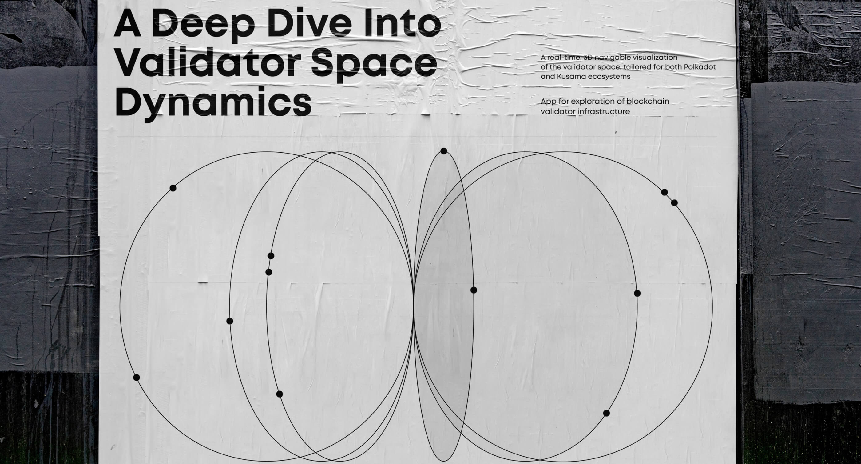
Motion design, 3D modelling, UI/UX
Figma, Blender, AfterEffects
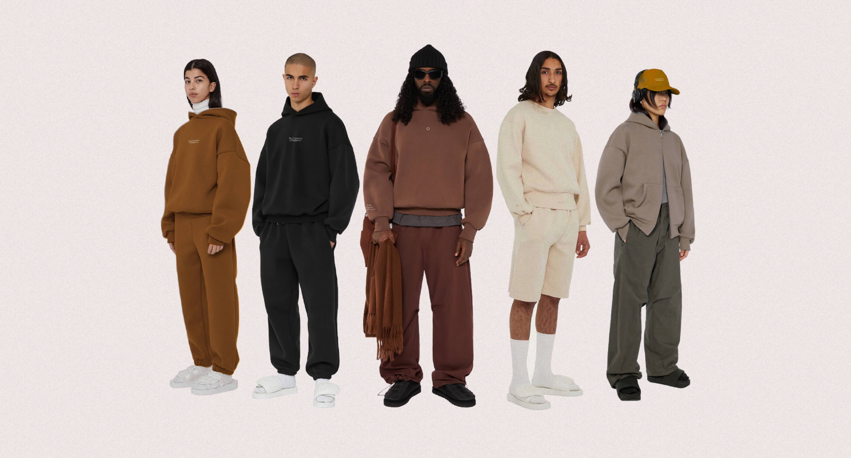
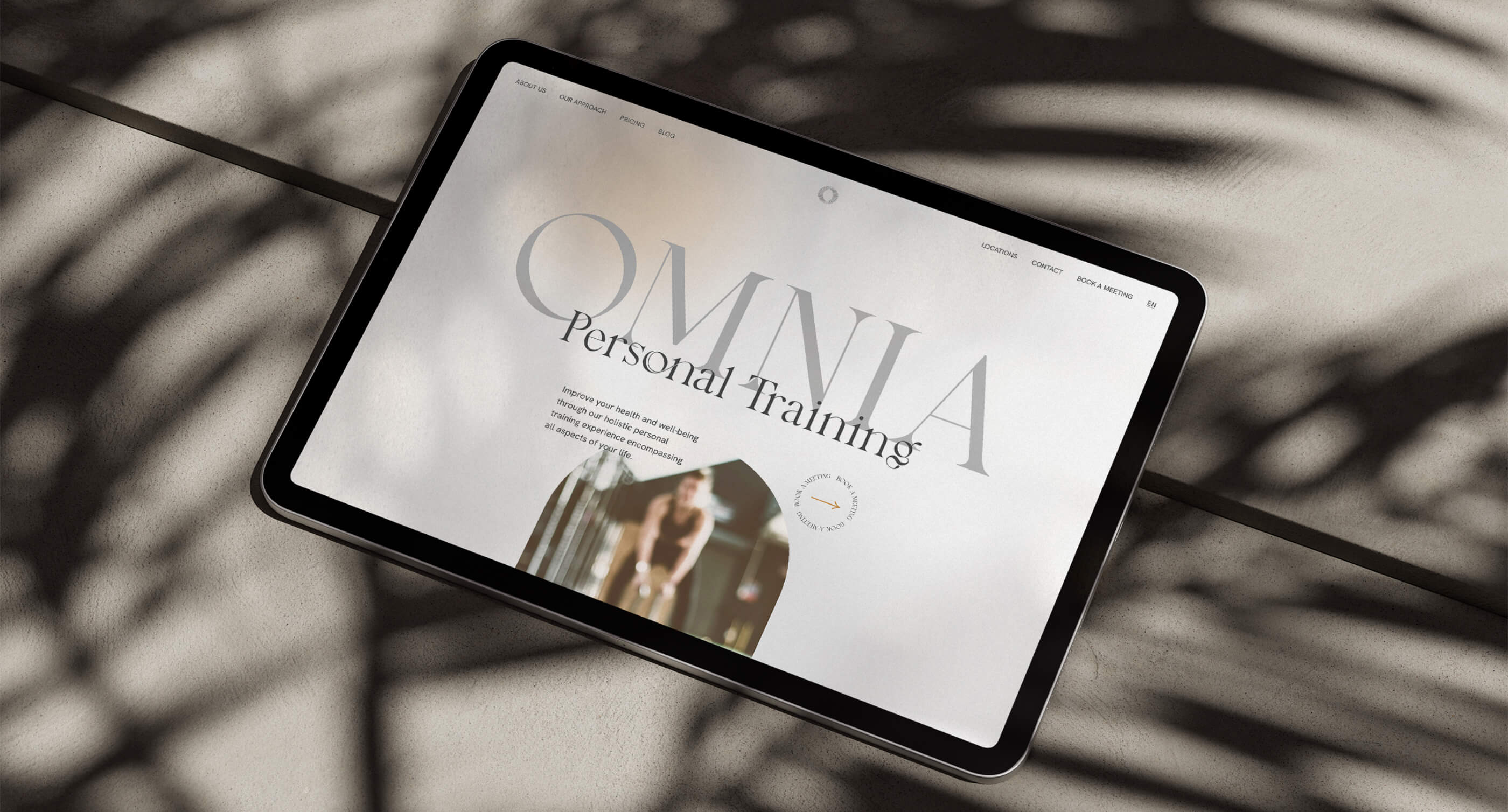
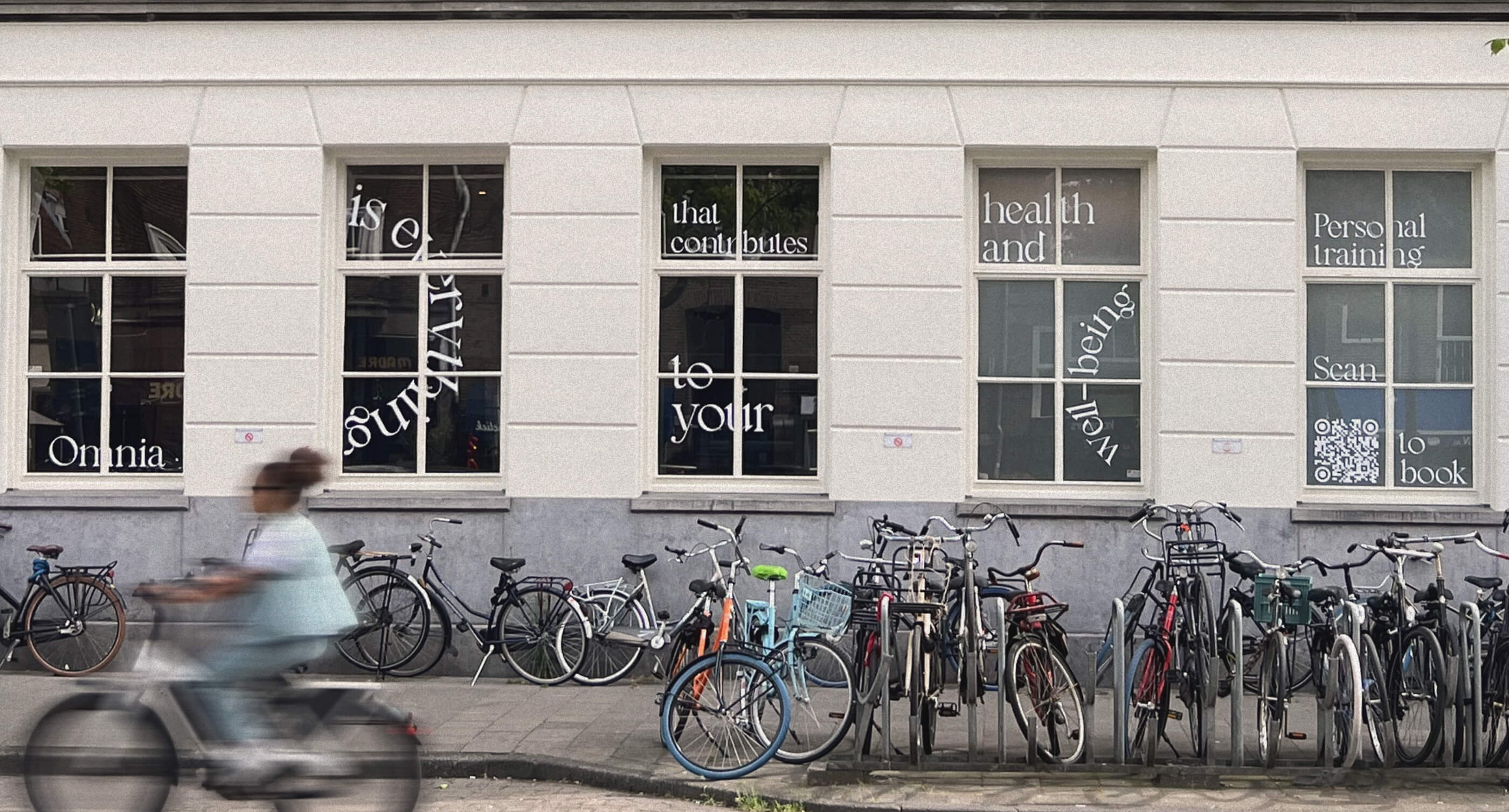
Omnia Redesign
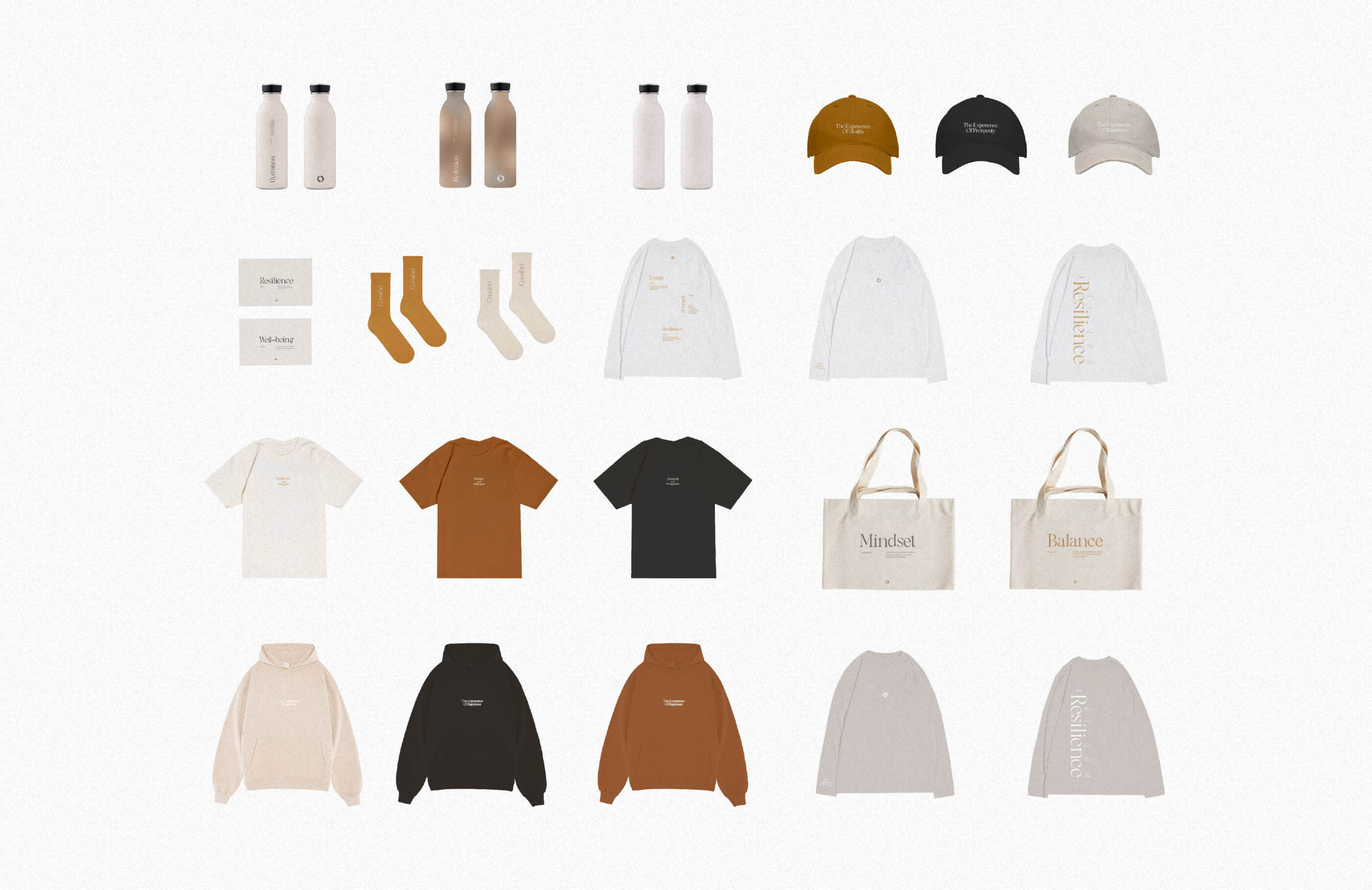
Reimagining the brand, blending visual tweaks with new merchandise and a stronger online presence.
Brand identity, Web-development, Web-design
Illustrator, Figma
Work with us
Make it fast!
instructions_and_conditions.txtExpress design is a faster and cheaper alternative for small businesses to full-scale projects with one simple rule: no edits or comments. This way, we can cut out all the project management and focus just on the design processes. Fast execution without any quality compromises.

