Making your competitors jealous Giving your ideas the right shape
We create professional design for memorable customer experience Helping you present ideas in the most effective way
Leo-Shipping Landing
Express landing page designed and developed in less than nine days
Web-design, Motion design, UI/UX
Figma, Adobe Photoshop, HTML, CSS
How to visually differentiate your business in a conservative industry? How to visually link physical operations and a digital experience? Is it possible to do it all with just a single landing page? The answer to the last question is "yes", and in this case, we will tell you about a landing page for Leo-Shipping, a freight forwarding company operating in Eastern Europe. We designed and developed the landing page in less than nine days as a part of our express design offering.

From the very start, the core project goal was to strongly and visually differentiate Leo-Shipping from its competitors. Most competitors are small to medium-sized enterprises with less than 20 employees, while Leo Shipping has less than ten employees. Therefore, the visual differentiation needed to be simple yet effective.
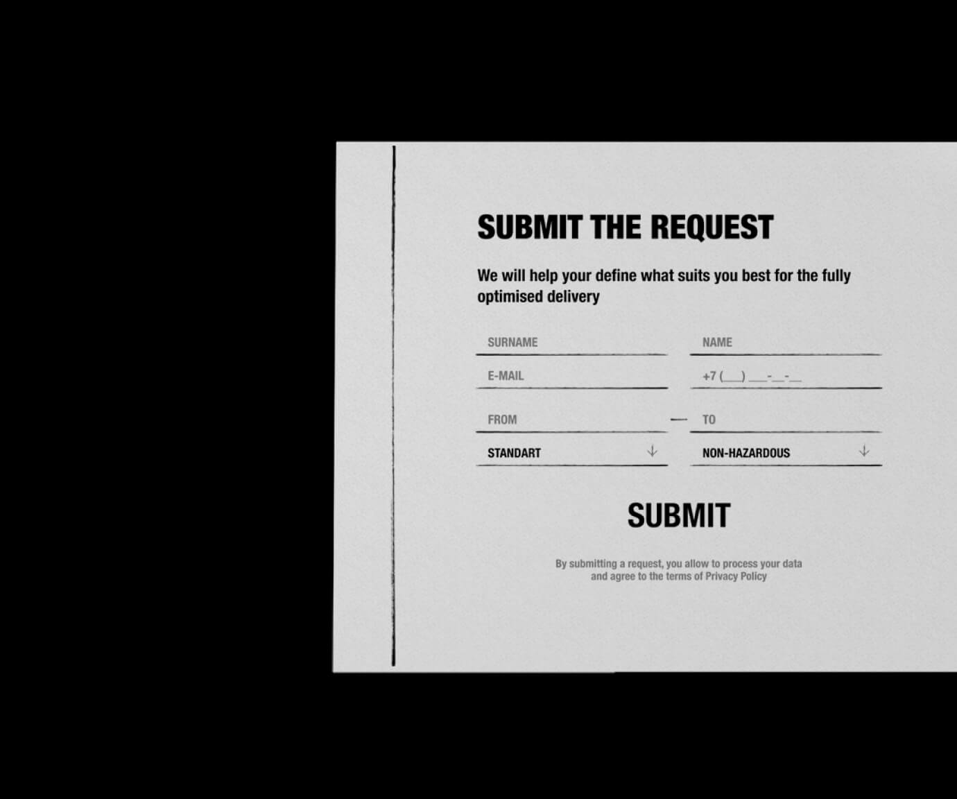
When we look into the logistics industry, we can see those design assets generally fall into either hyper minimalistic UI - which is especially common among the logistics web apps - or over-officialised and rather often outdated materials. On average, customers are deep-rooted in the industry: they are specialists with 15+ years of experience, which is not only limited by office operations. Therefore, we decided to base our design on references to familiar port-related objects, such as old announcement boards and engine oil.
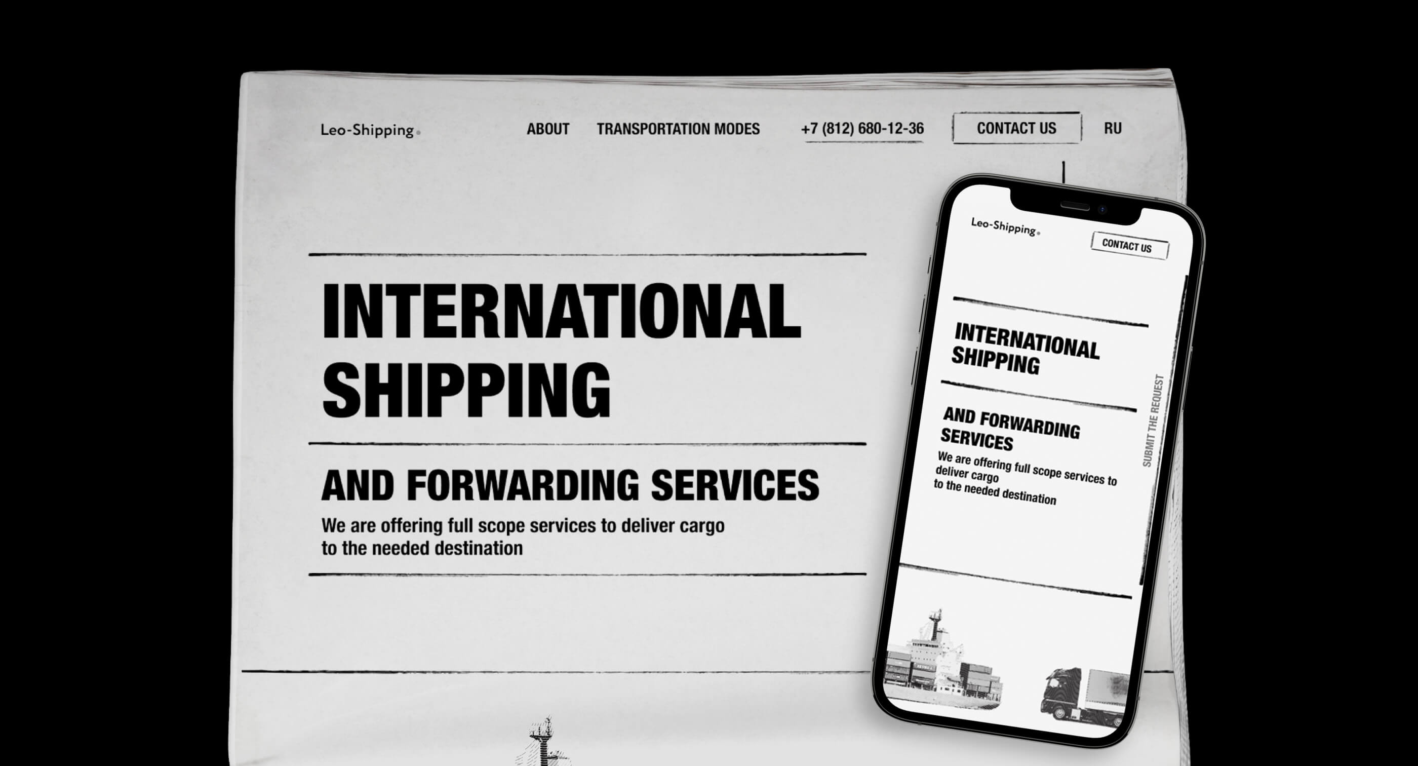
Our colour palette and fonts strongly support our core objective. For the supporting assets, we decided to create retro newspaper-like visuals. This way, the landing would carry the workers' announcement board feeling. Additionally, the selected colours are not just black and white, but they provide a paper-like look.
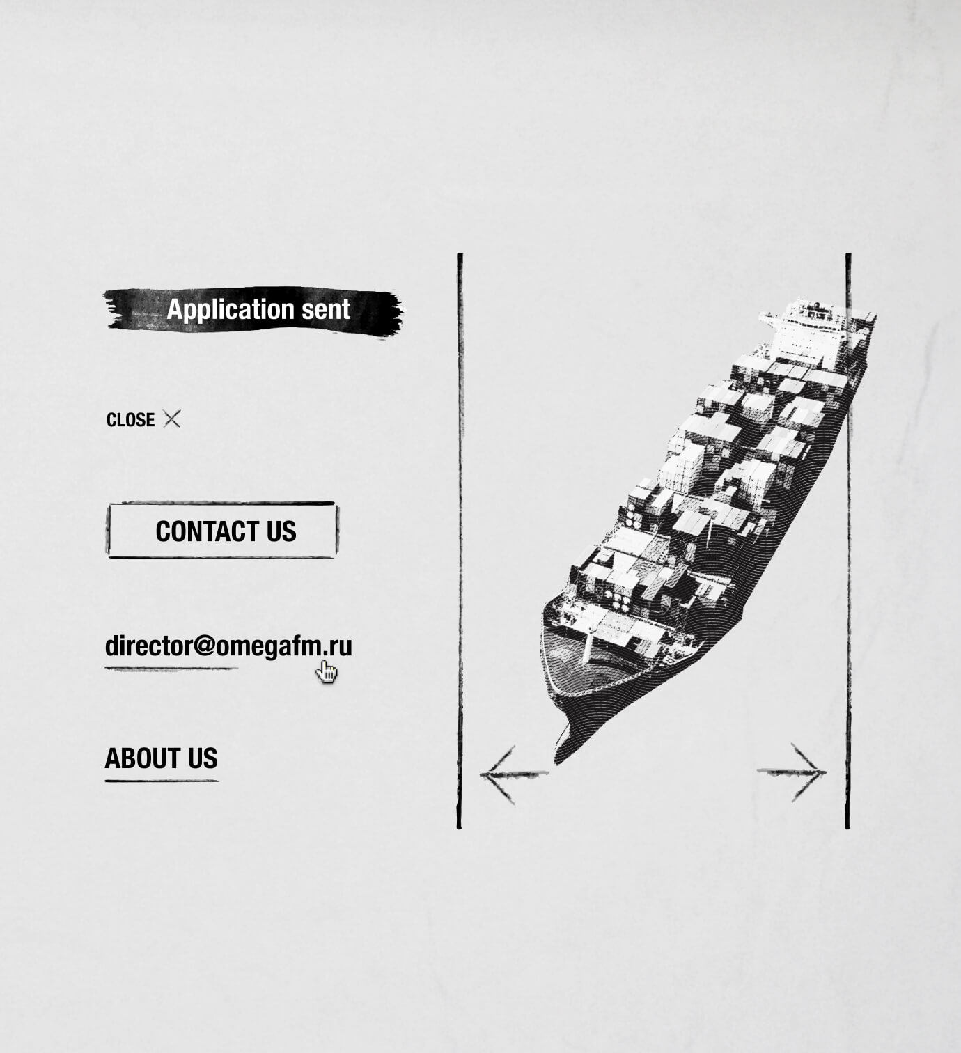
Leo-Shipping's target audience is 45+ years old on average. This fact primarily affected the font hierarchy and colour contrasts - we ensured that all texts carry a high level of readability and accessibility. While the landing page is visually referencing newspapers, at the same time, we wanted to keep it dynamic. Therefore, we created a set of simple animations, which are very fast to load, and at the same time, don't distract from the main text.
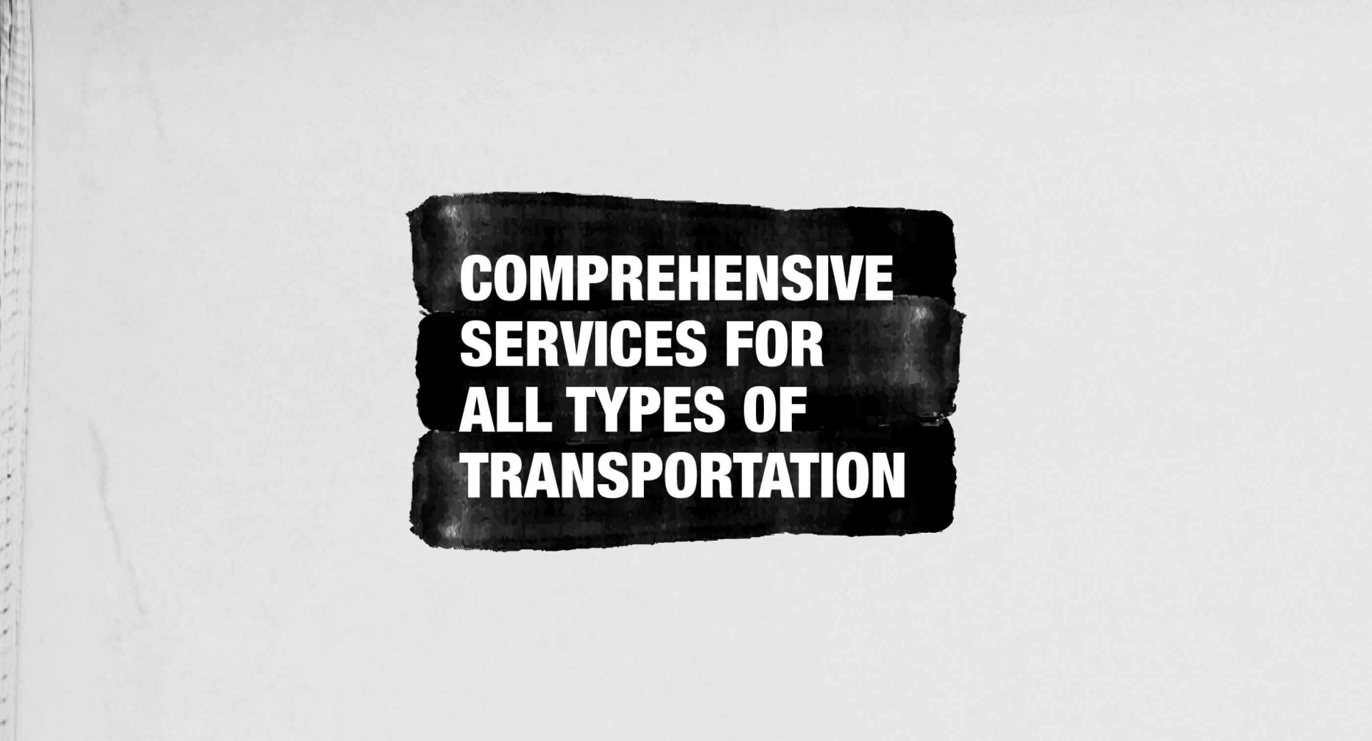
Lastly, we ensured a maximum level of responsiveness and extended browser compatibility. With all of this combined, our solution stayed simple, fast to load, yet catchy to the eye, especially compared to the industry competitors.
-
CONCEPT: Aleksandra Shwagerus
-
WEB: Ksenia Leonteva
-
ANIMATION: Lena Sivakova
-
PROJECT FINISHED: 19.03.2021
-
TOTAL WORKING DAYS: 8
Other projects
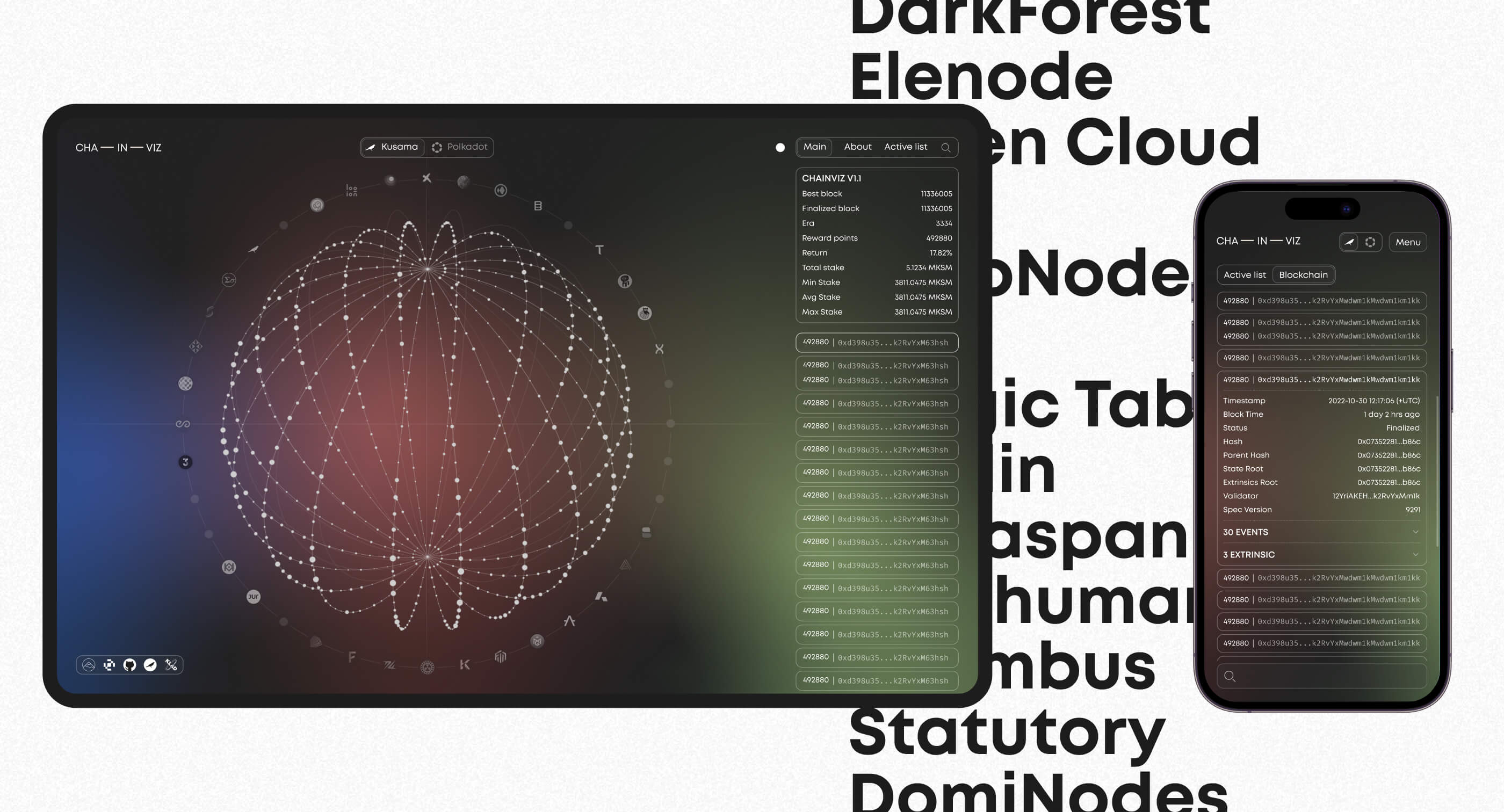
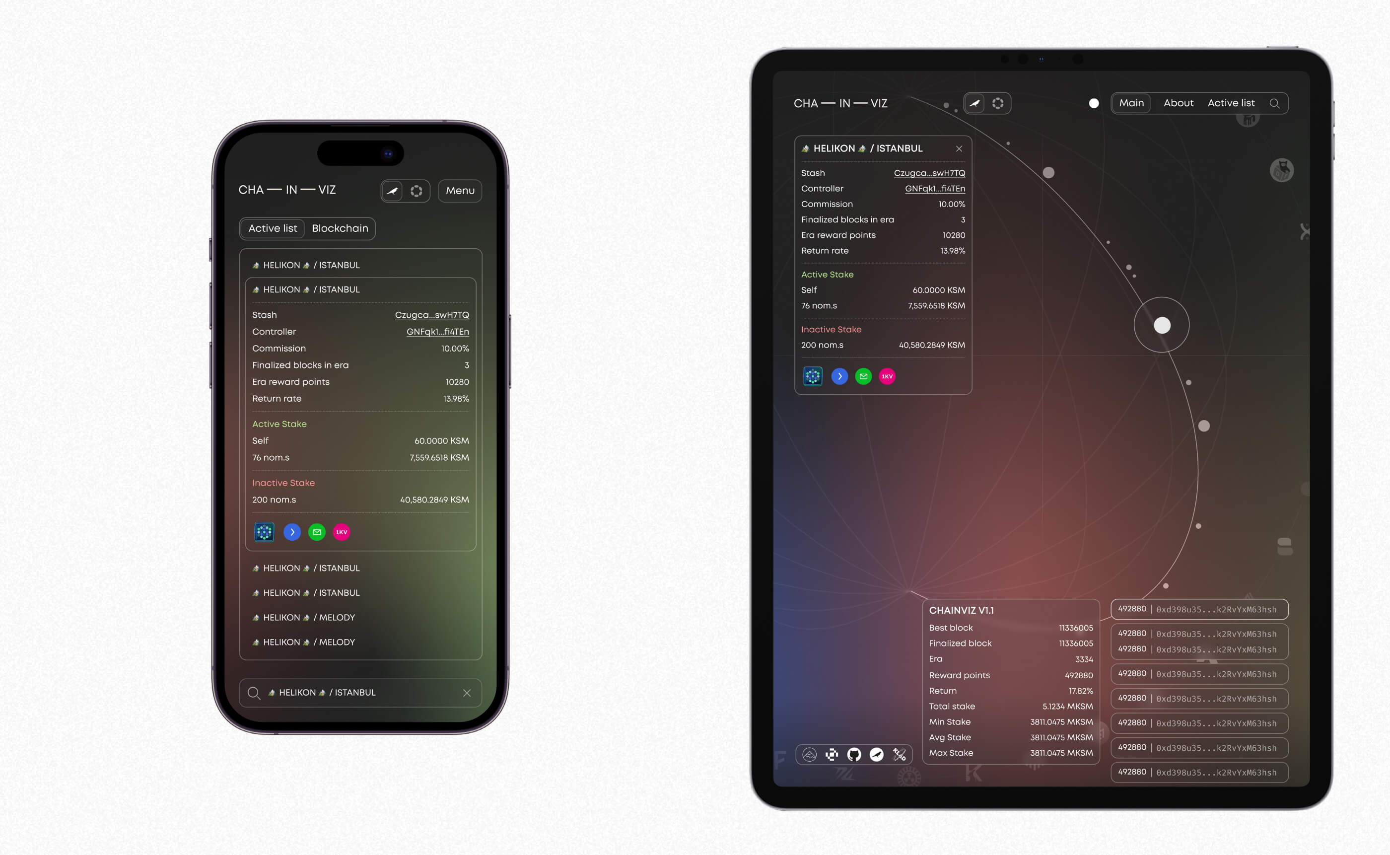
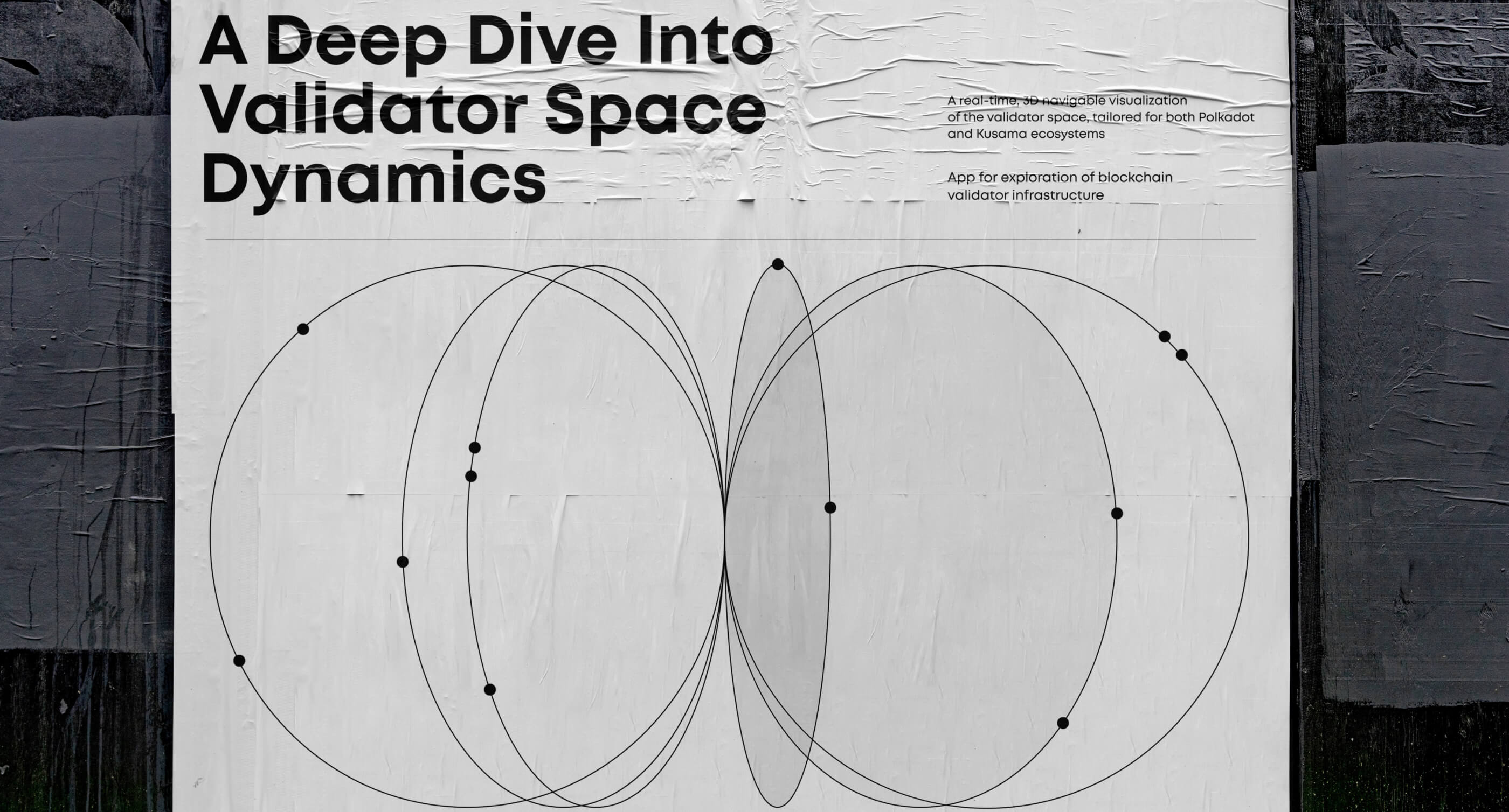
Chainviz Web App
Visualizing validator space with intuitive, responsive web app design
Motion design, 3D modelling, UI/UX
Figma, Blender, AfterEffects
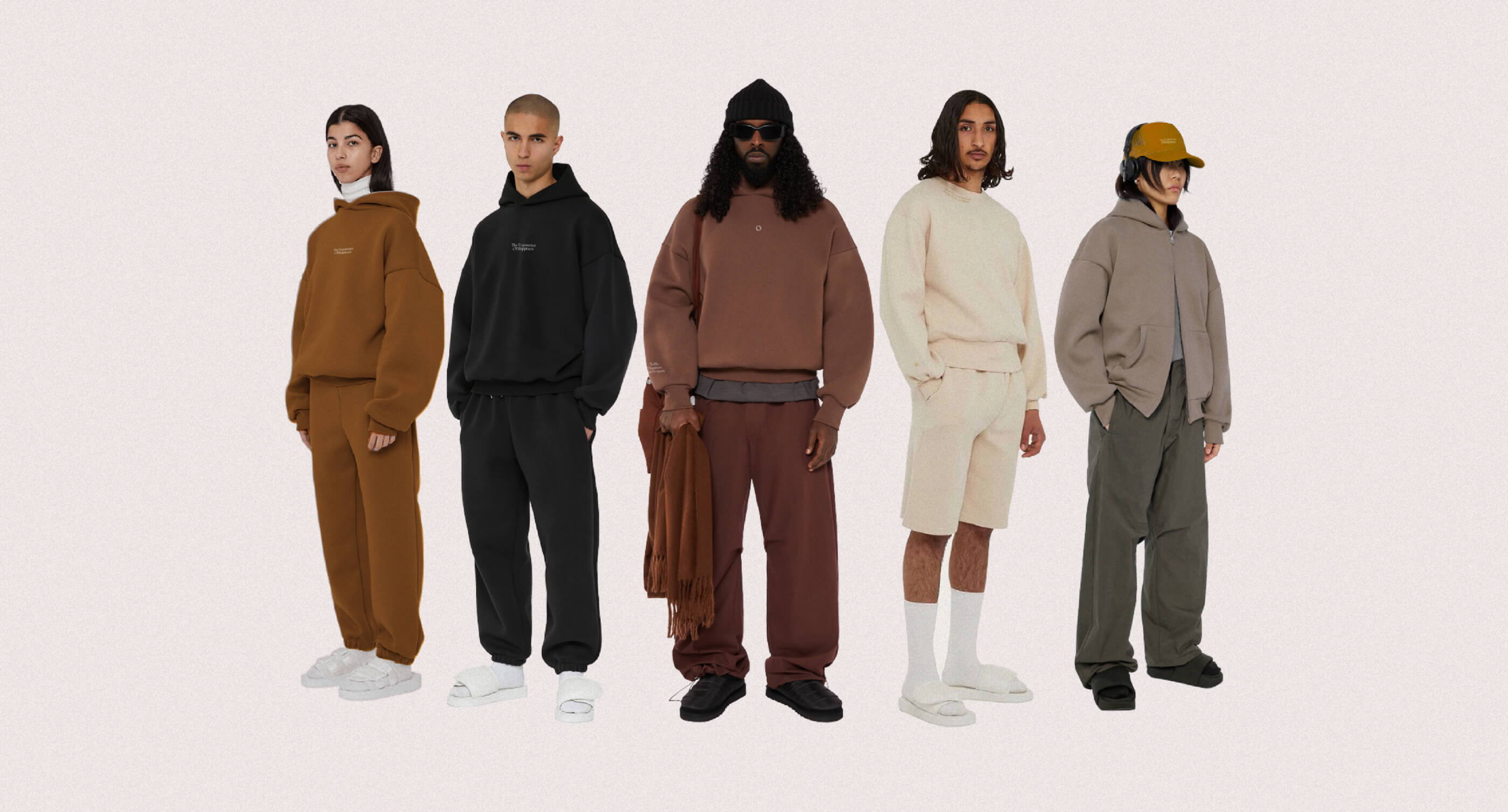
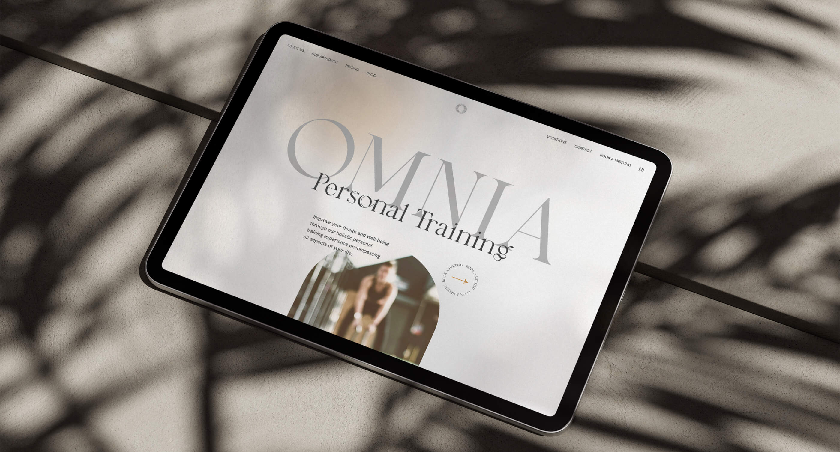
Omnia Redesign
Reimagining the brand, blending visual tweaks with new merchandise and a stronger online presence.
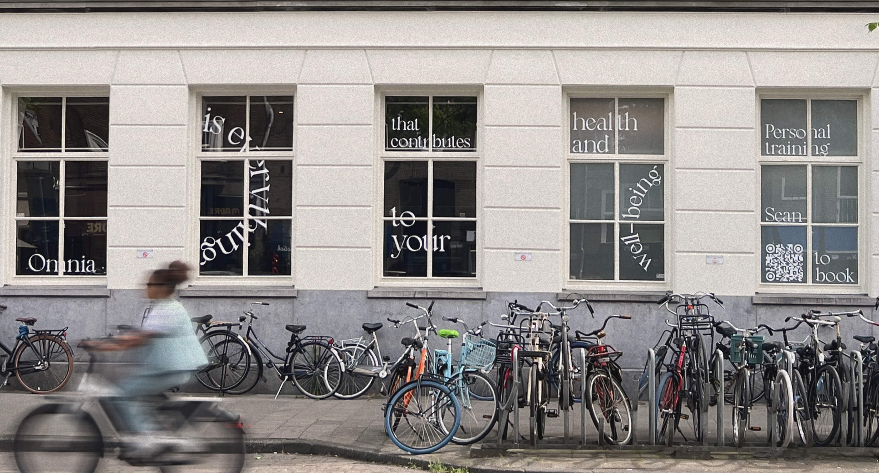
Brand identity, Web-development, Web-design
Illustrator, Figma
Work with us
Make it fast!
instructions_and_conditions.txtExpress design is a faster and cheaper alternative for small businesses to full-scale projects with one simple rule: no edits or comments. This way, we can cut out all the project management and focus just on the design processes. Fast execution without any quality compromises.

