Making your competitors jealous Giving your ideas the right shape
We create professional design for memorable customer experience Helping you present ideas in the most effective way
PMN Product Launch
Product launch 3D assets for personal journaling company
SMM, Motion design, 3D modelling, Sound design
Figma, Blender, After Effects
The use of the 3D models becomes more and more widespread for the product's initial launches and web presentations. The key reason is its versatility and many ways the model can be re-utilised in various design processes. While the initial development of hyperrealistic 3D assets sometimes might be a complicated task, in some situations, it is an ultimately versatile solution that can save loads of time in future design and marketing. In this case study, we will tell more about the benefits, difficulties and overall process of creating 3D design assets for Plus-Minus-Null, a startup focused on personal journaling.
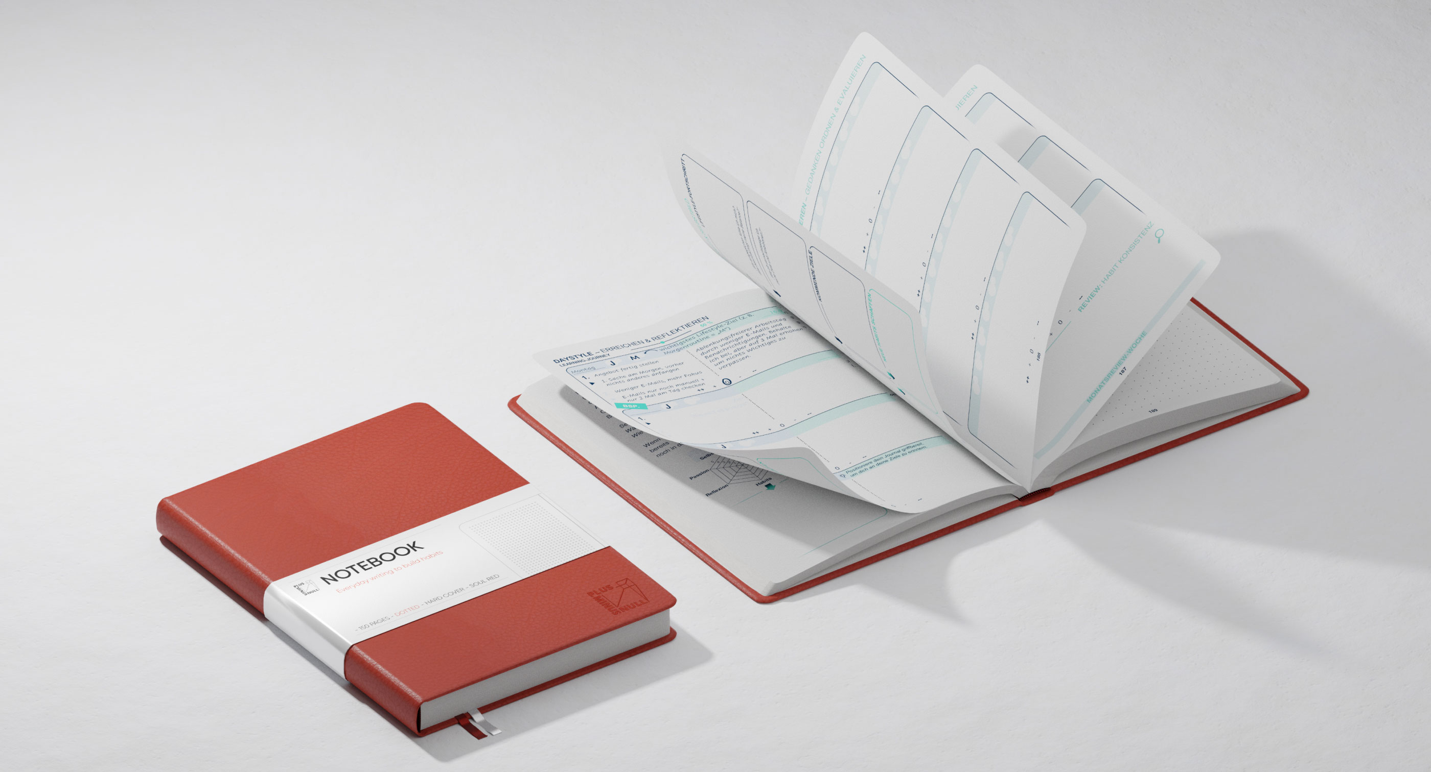
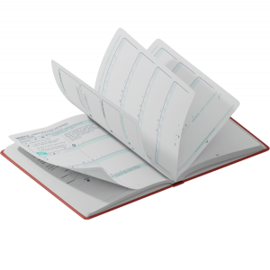
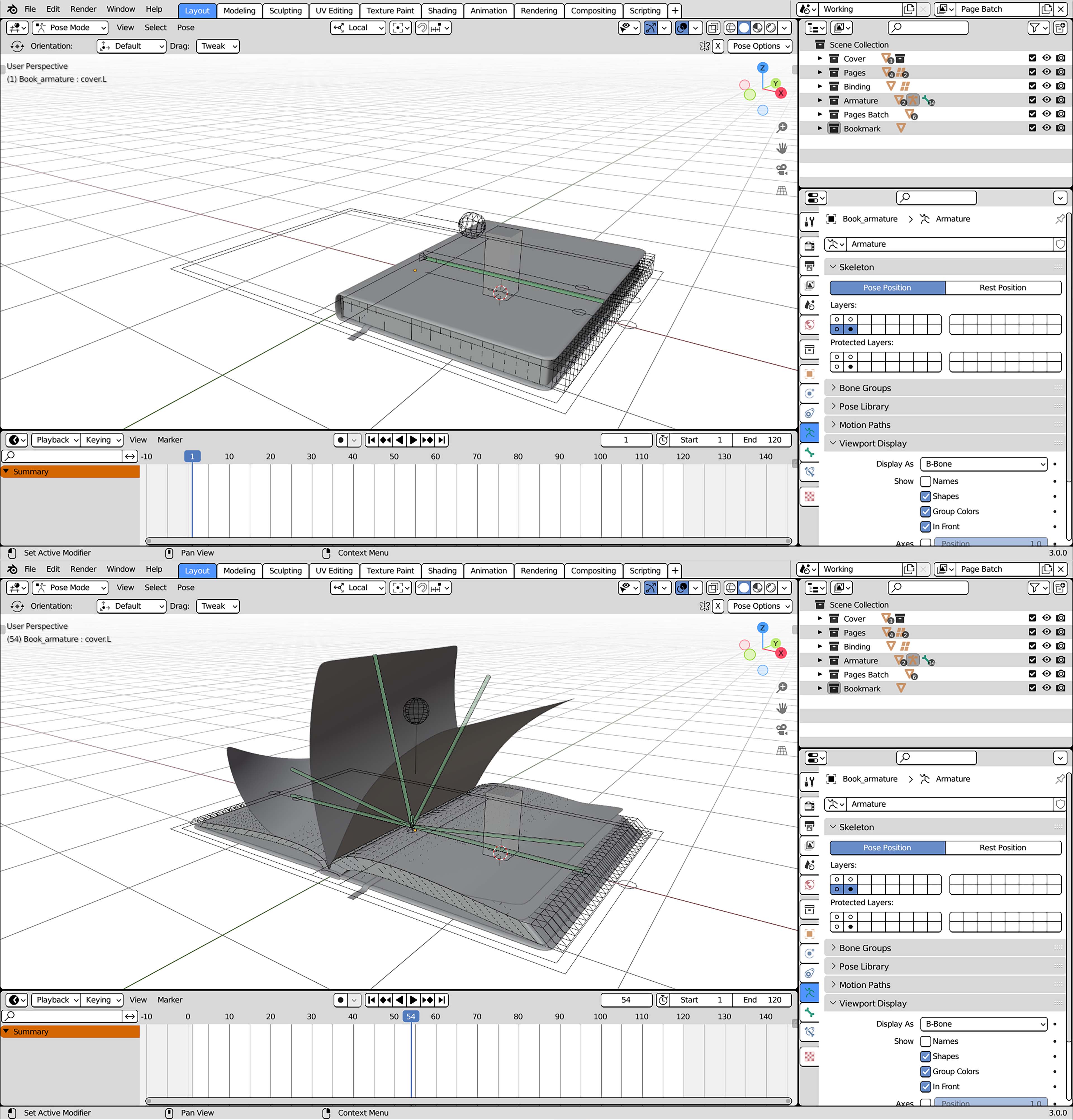
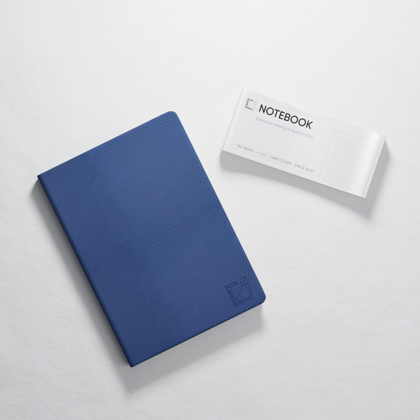
The project started with the 3D modelling part, which was crucial for the project as we later reused model in animation, social media posts and web concepts. Journal rigging and modelling were especially tricky due to the pages' physics as well as the way pages fold and flip. Texturing and shading are rather consequential in product modelling as it defines way a model is perceived and what impression it gives of a physical product.
Capturing the actual feel and look of the notebook was extra challenging as we based the perceived colour on the Pantone colour codes provided online by the manufacturer. However, it is not just limited by the colour change as colour perception strongly depends on the material. In the case of the PMN journal, we especially needed to balance the matte texture of the faux leather for the cover.
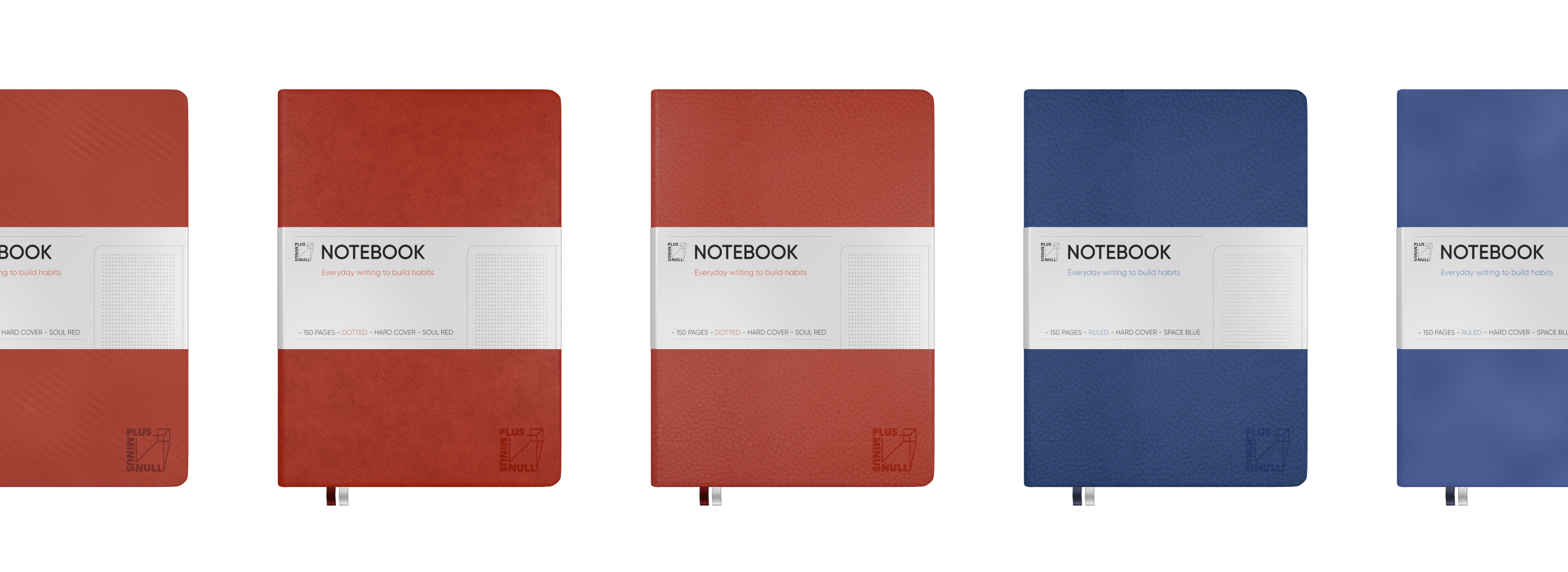
For the launch, we wanted to emphasise the product and its key features that differentiate it from other journals. To do so, we tried to keep the background minimalistic, with the journal-focused lightning and a series of multi-angle shots highlighting the core segments of the notebook.
Klad also designed the final soundtrack that we used in the animation. The soundtrack helped us provide a youthful and powerful feel throughout the video: sound starts slowly and builds up through the video with the core drop accented around the final CTA.
PMN focused their core advertising around Instagram, so we also helped them to create a set of social media posts. Some posts worked as an audience daily build-up before the final launch, while others focused on supporting audience product engagement.
When the business is focused on a single product, 3D becomes an ultimate solution to optimise the design and boost the product impression. A high-quality 3D model correctly used on the website can strongly redefine digital experience and increase conversions.
When the business is focused on a single product, 3D becomes an ultimate solution to optimise the design and boost the product impression.
-
MODELLING: Lena Sivakova
-
ANIMATION: Lena Sivakova
-
SOUND: Aleksey Kurochkin
-
WEB: Ksenia Leonteva
-
PROJECT FINISHED: 17.12.2020
-
TOTAL WORKING DAYS: 28
Other projects
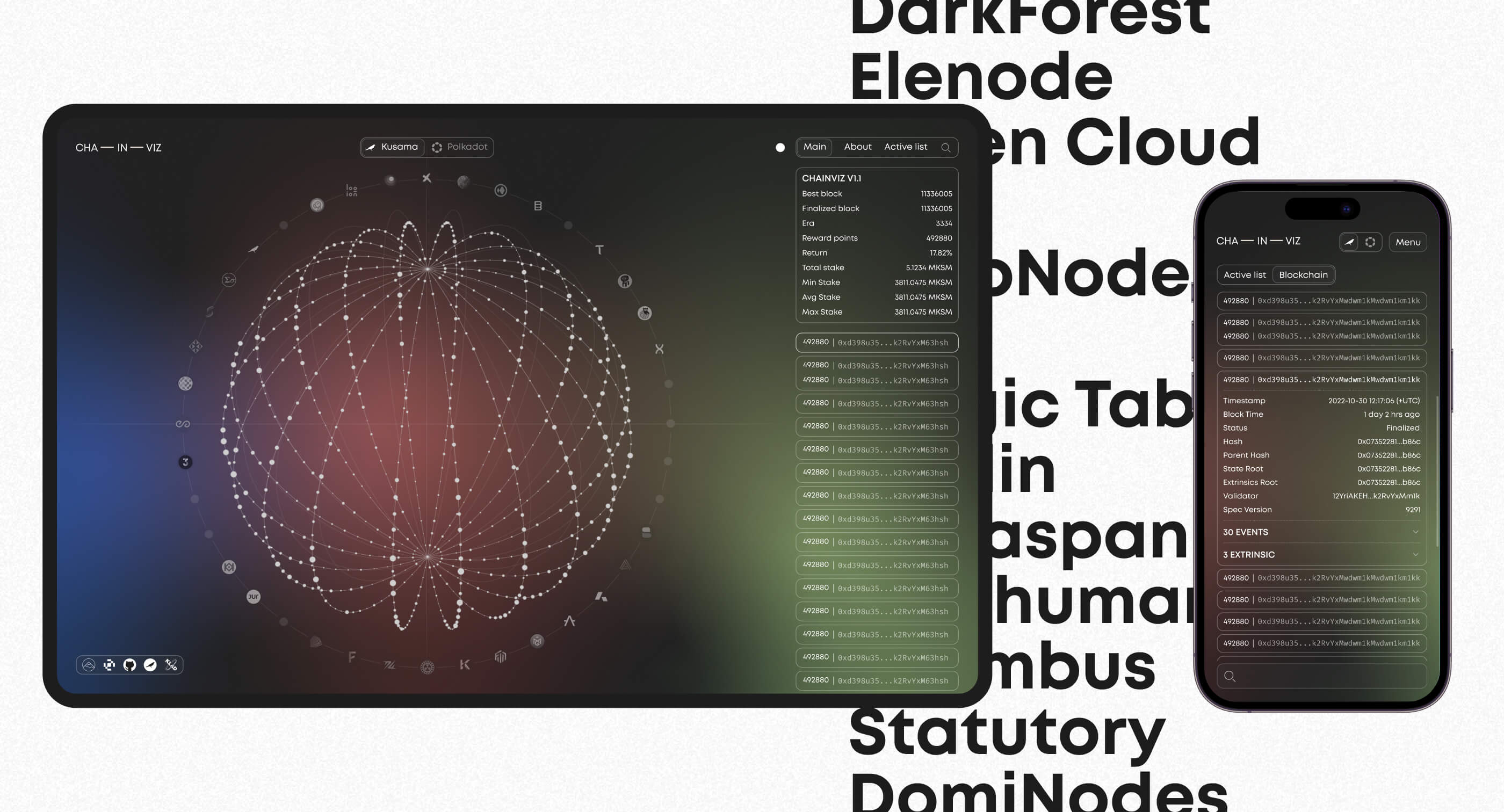
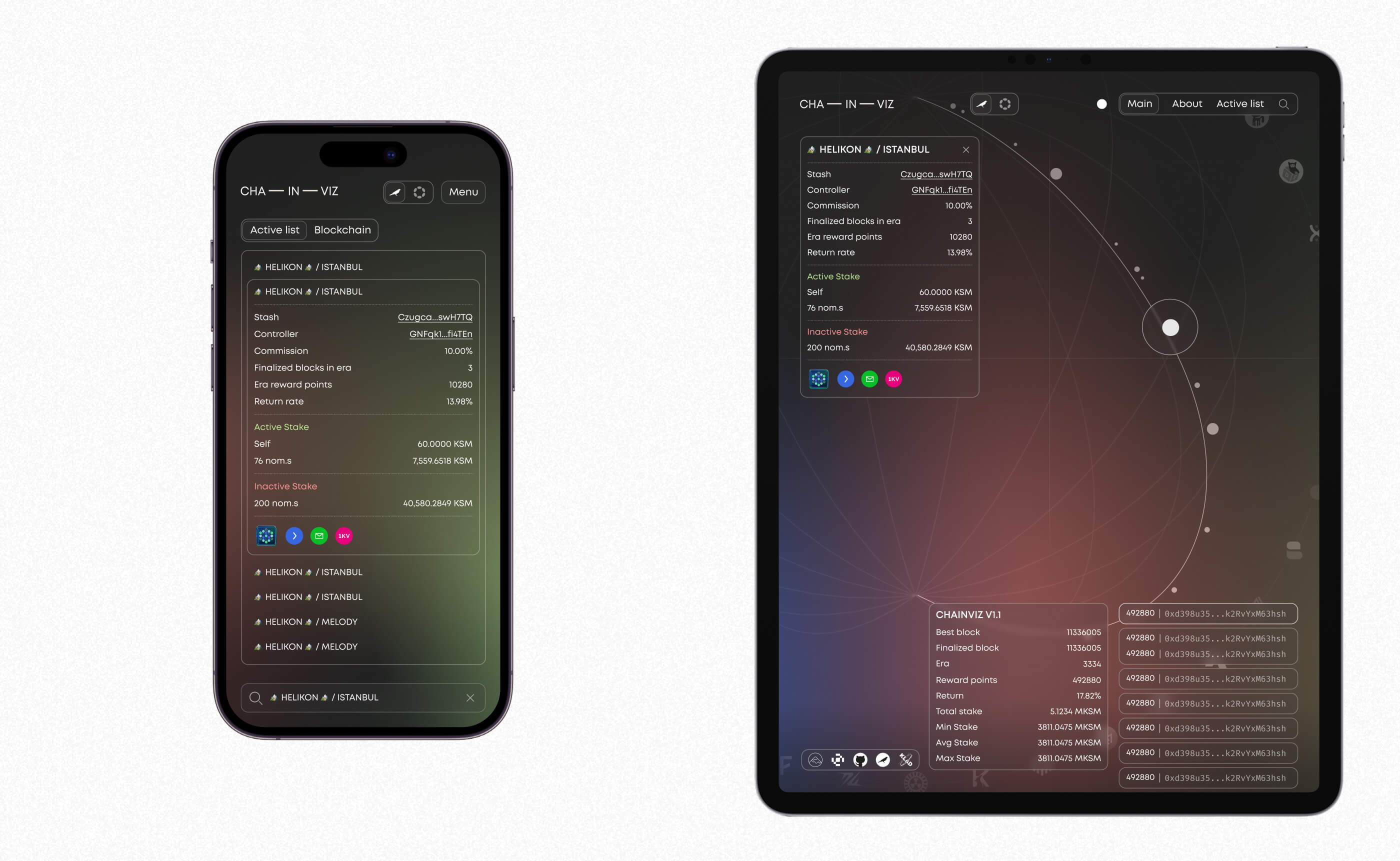
Chainviz Web App
Visualizing validator space with intuitive, responsive web app design
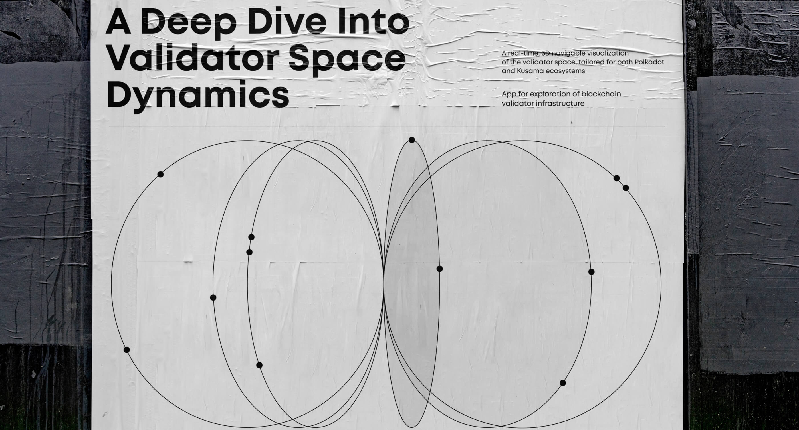
Motion design, 3D modelling, UI/UX
Figma, Blender, AfterEffects
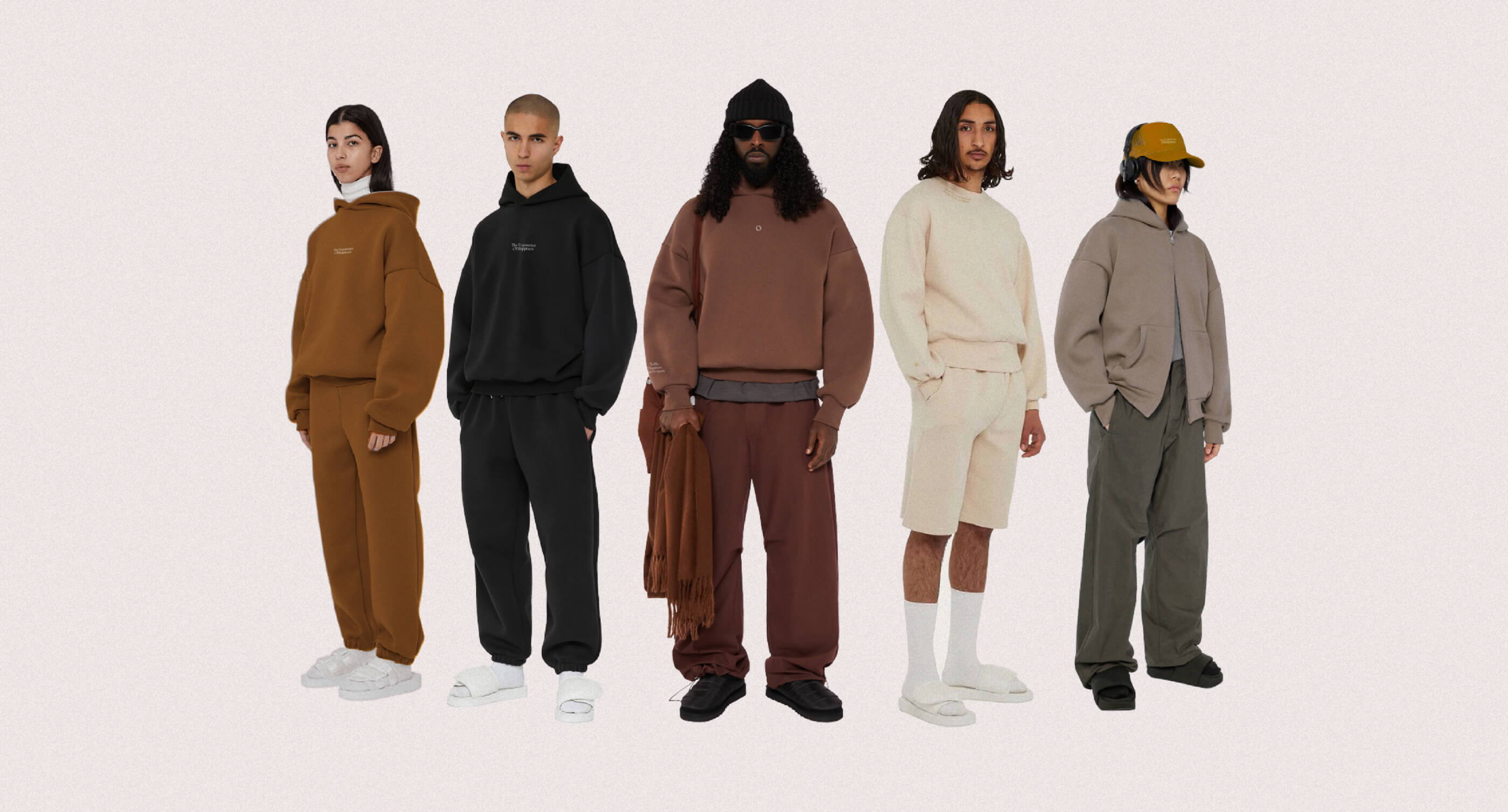
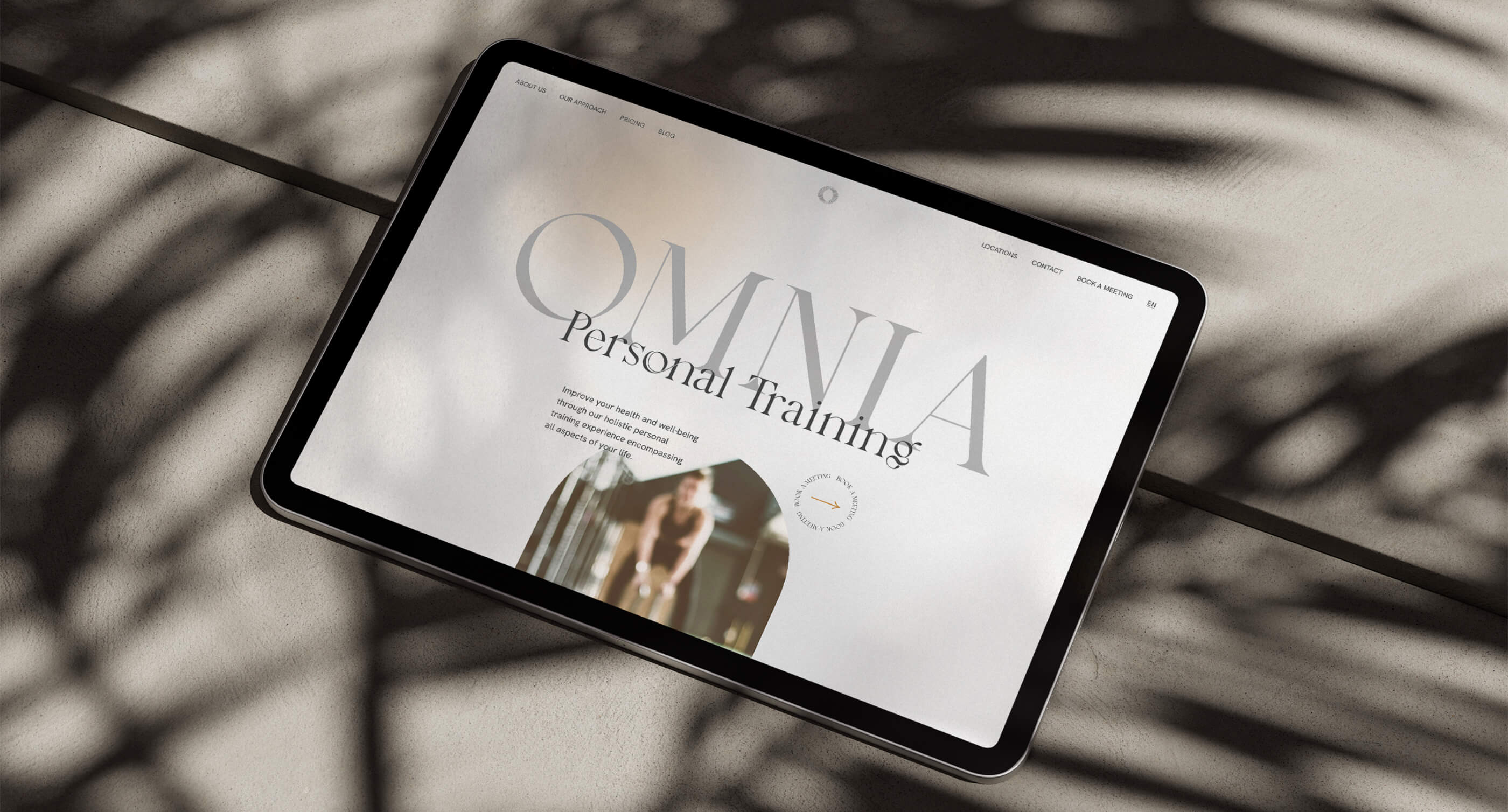
Omnia Redesign
Reimagining the brand, blending visual tweaks with new merchandise and a stronger online presence.
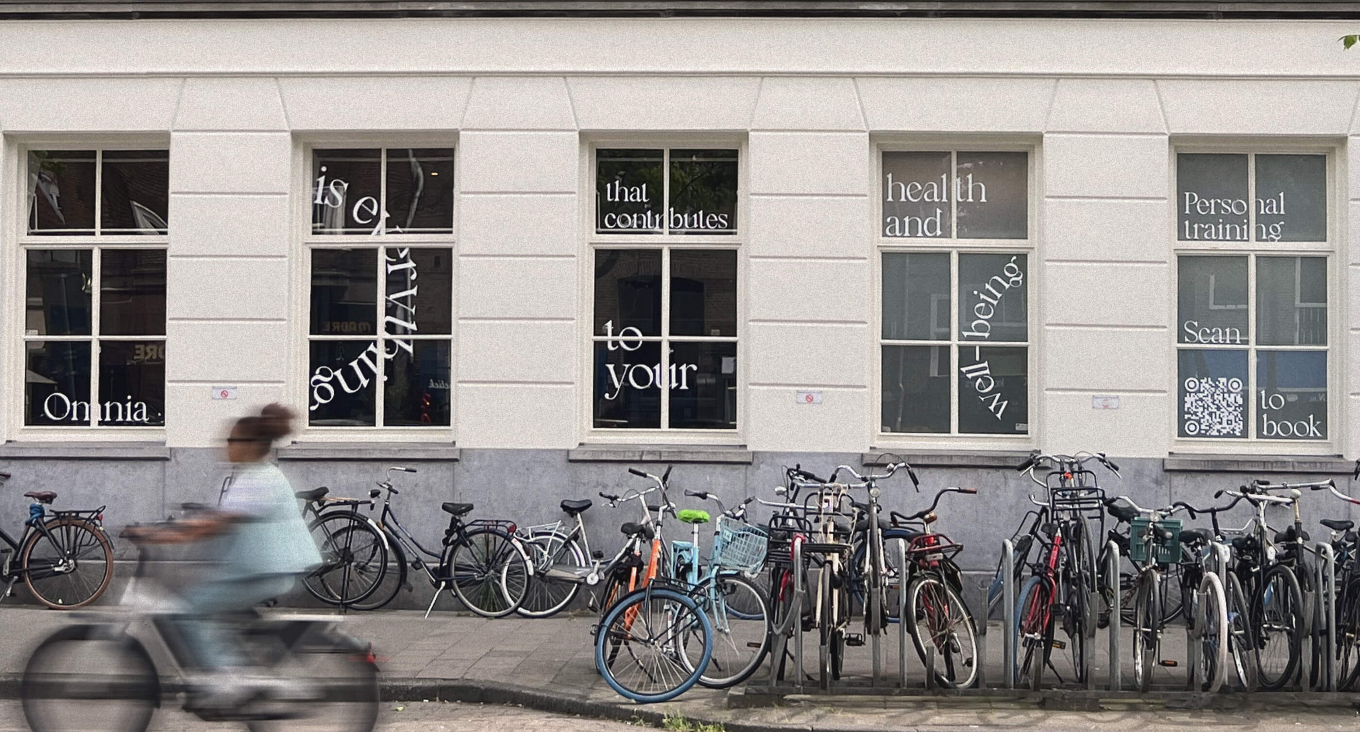
Brand identity, Web-development, Web-design
Illustrator, Figma
Work with us
Make it fast!
instructions_and_conditions.txtExpress design is a faster and cheaper alternative for small businesses to full-scale projects with one simple rule: no edits or comments. This way, we can cut out all the project management and focus just on the design processes. Fast execution without any quality compromises.

