Making your competitors jealous Giving your ideas the right shape
We create professional design for memorable customer experience Helping you present ideas in the most effective way
UBC Website
Express core website design and development with unconventional layout for a biotech company
Web-development, Web-design, 3D modelling
Figma, Blender, HTML, CSS, Tailwind
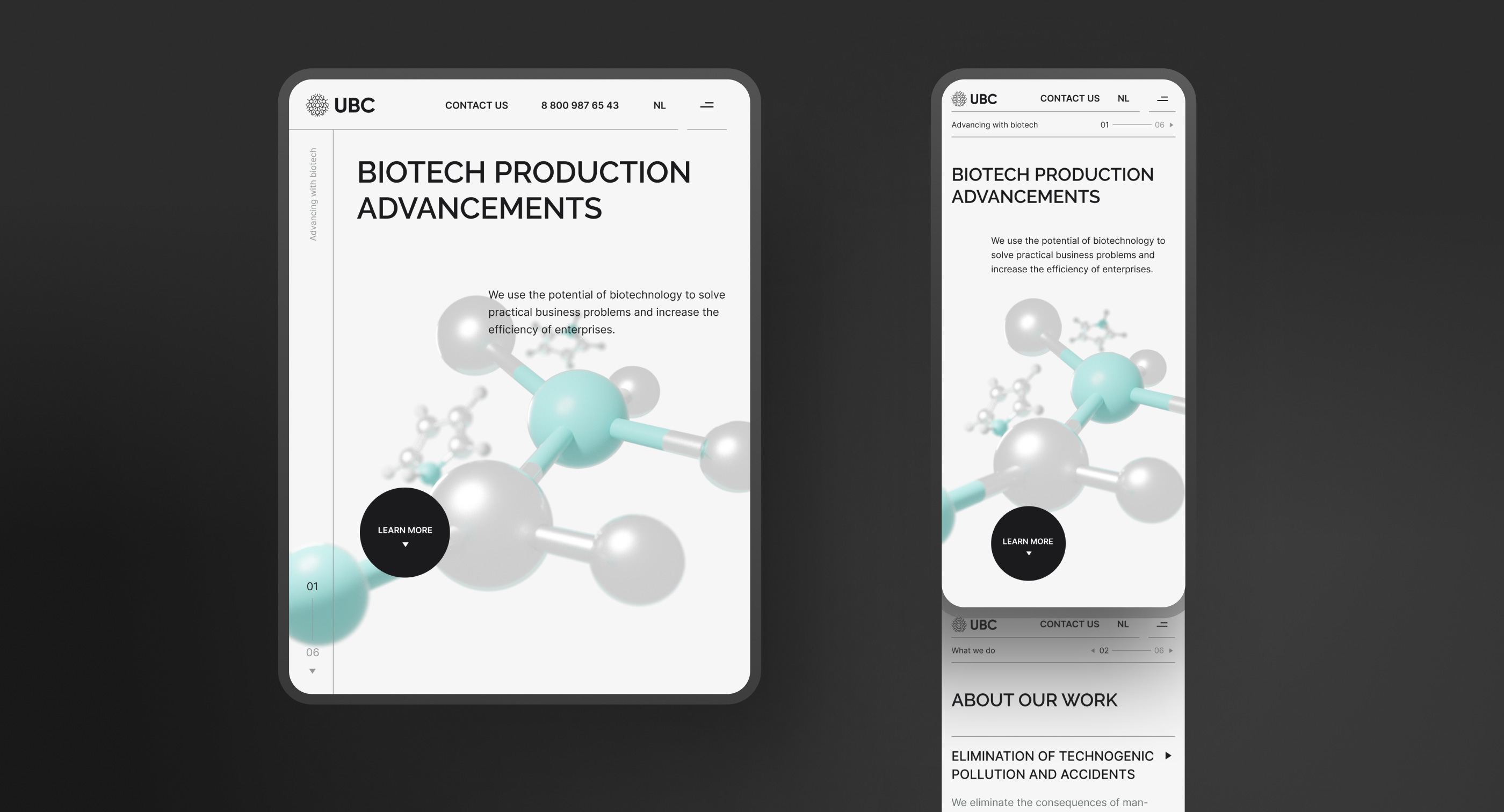
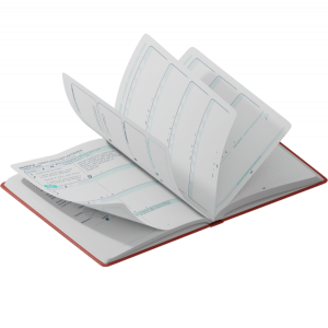
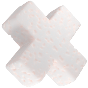
To make the company stand out, we created a 3D visual for the hero section that would create an instant user association with the biotech field. We also went for a minimalistic and clean presentation with a white background and sans serif fonts. The cursor would change its look depending on different blocks and elements, making the page feel more dynamic.
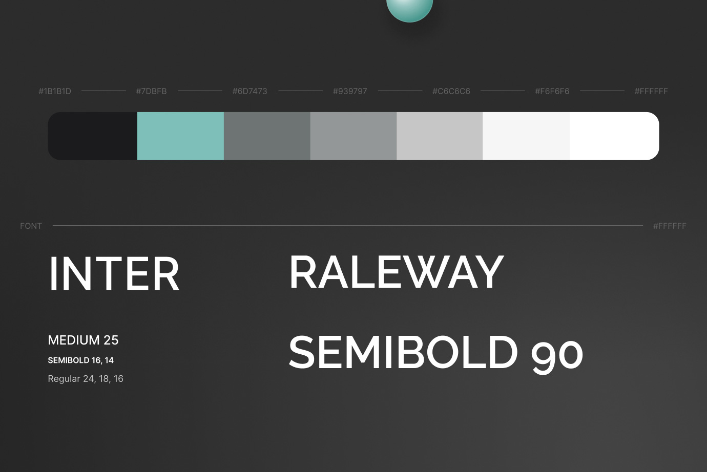
To make the website unique and memorable, we applied an unconventional layout. The page navigation appears on the left side starting from the second block. All the core content is on the right in a multi-level structure, meaning the elements of some blocks unfold with more information.
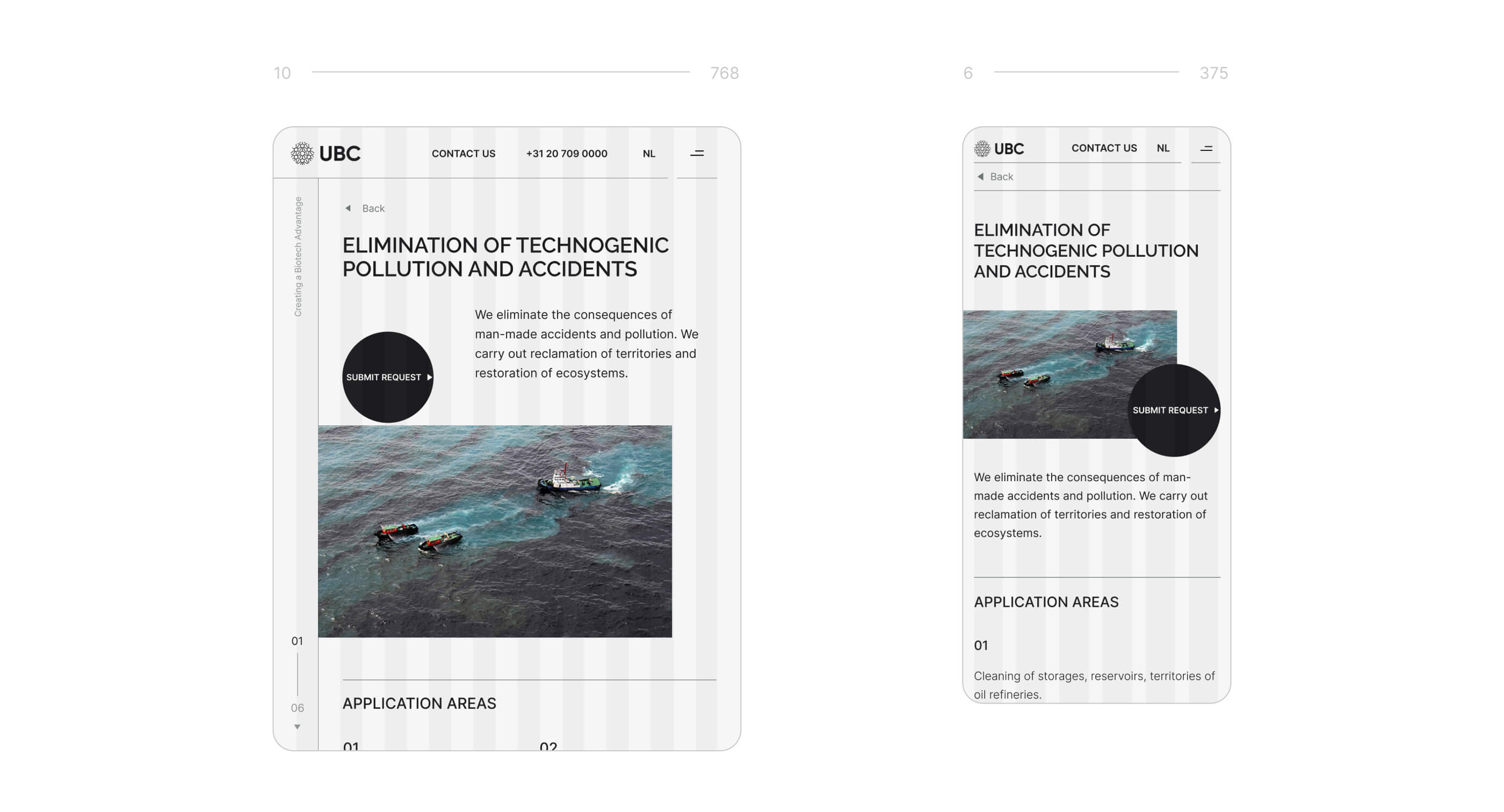
When we create websites, we start with the conceptualisation step, which we discuss with the client before finalising the page design. All the web design processes are done in Figma, while the supporting animations are most often created using Adobe AfterEffects. In the case of UBC, we also created 3D models using Blender.
In the mid scroll section, the page switches palette from light to dark: this maintains the professional look and also helps with user retention throughout the page scroll. Each block also has some level of variation in layout, including multi-level structures, double-column content and more.
Klad also maintained a slide-like scroll focusing users more on the content sections. While it seems simple, a custom section scroll is enormously complex in development, especially in the cases of nested scrolls combined with custom layouts. However, this feature sometimes can make the page feel absolutely different UX-wise.
Apart from the main page, we have also designed and developed secondary sections, including about us, services and blog pages. These pages follow the main page layout to maintain visual coherence. As a little extra, we also provided up to five block variations for the cases and services sections. This way, every secondary page can appear different while following the same design. We design cookies acknowledgement, terms&conditions and 404 pages as a part of every website we build.
The development was done using HTML, CSS, JavaScript and Tailwind. For content management, we always go for open-source solutions only, which are usually based on JavaScript (such as Strapi) or PHP. In this case, we went with the October CMS, which is very easy to deploy and maintain for the customer.
-
WEB DESIGN: Ksenia Leonteva
-
WEB DEVELOPMENT: Vladimir Shepel
-
3D & MOTION: Lena Sivakova
-
PROJECT FINISHED: 30.08.2021
-
TOTAL WORKING DAYS: 24
Other projects
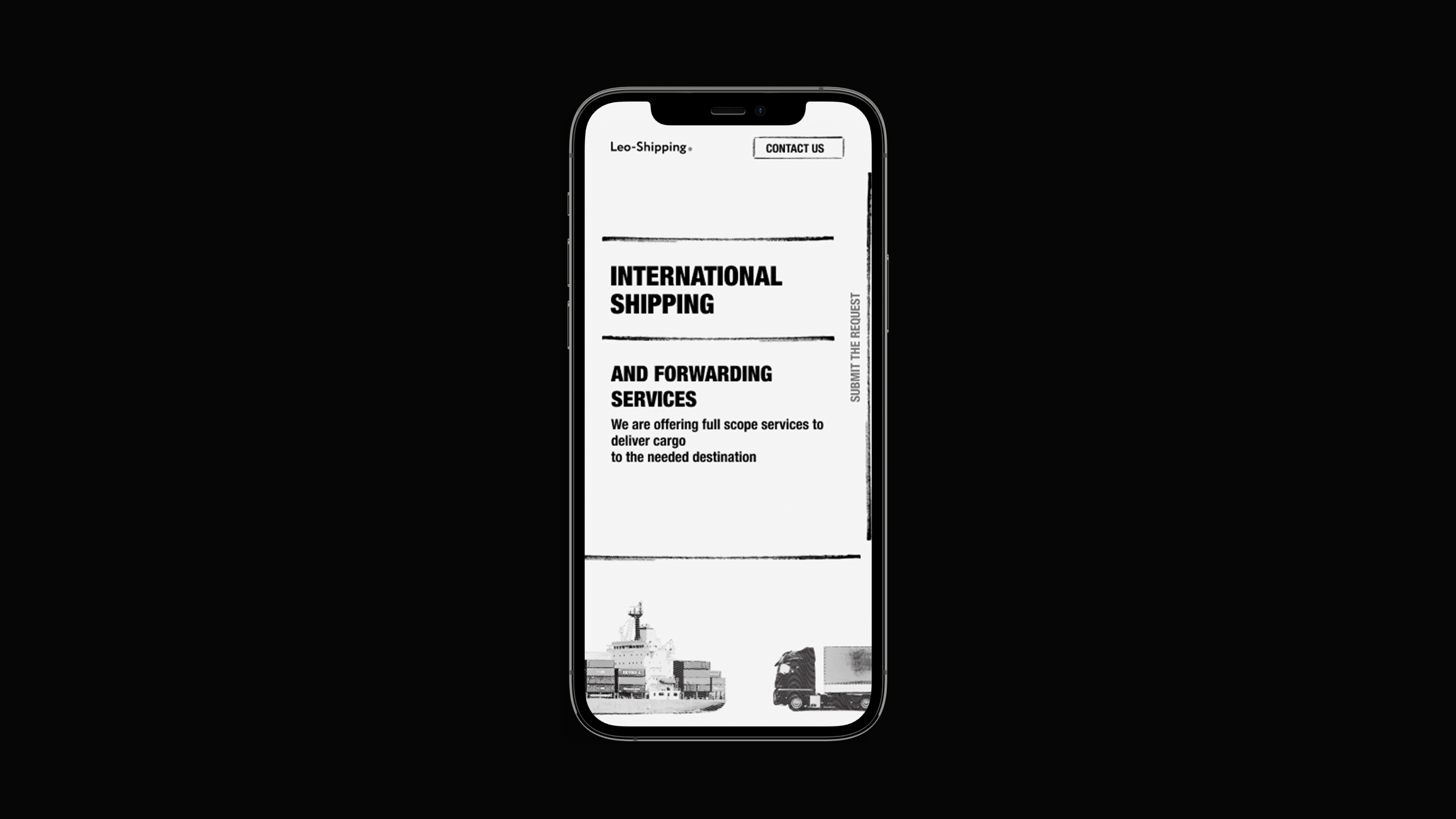
Leo-Shipping Landing
Express landing page designed and developed in less than nine days
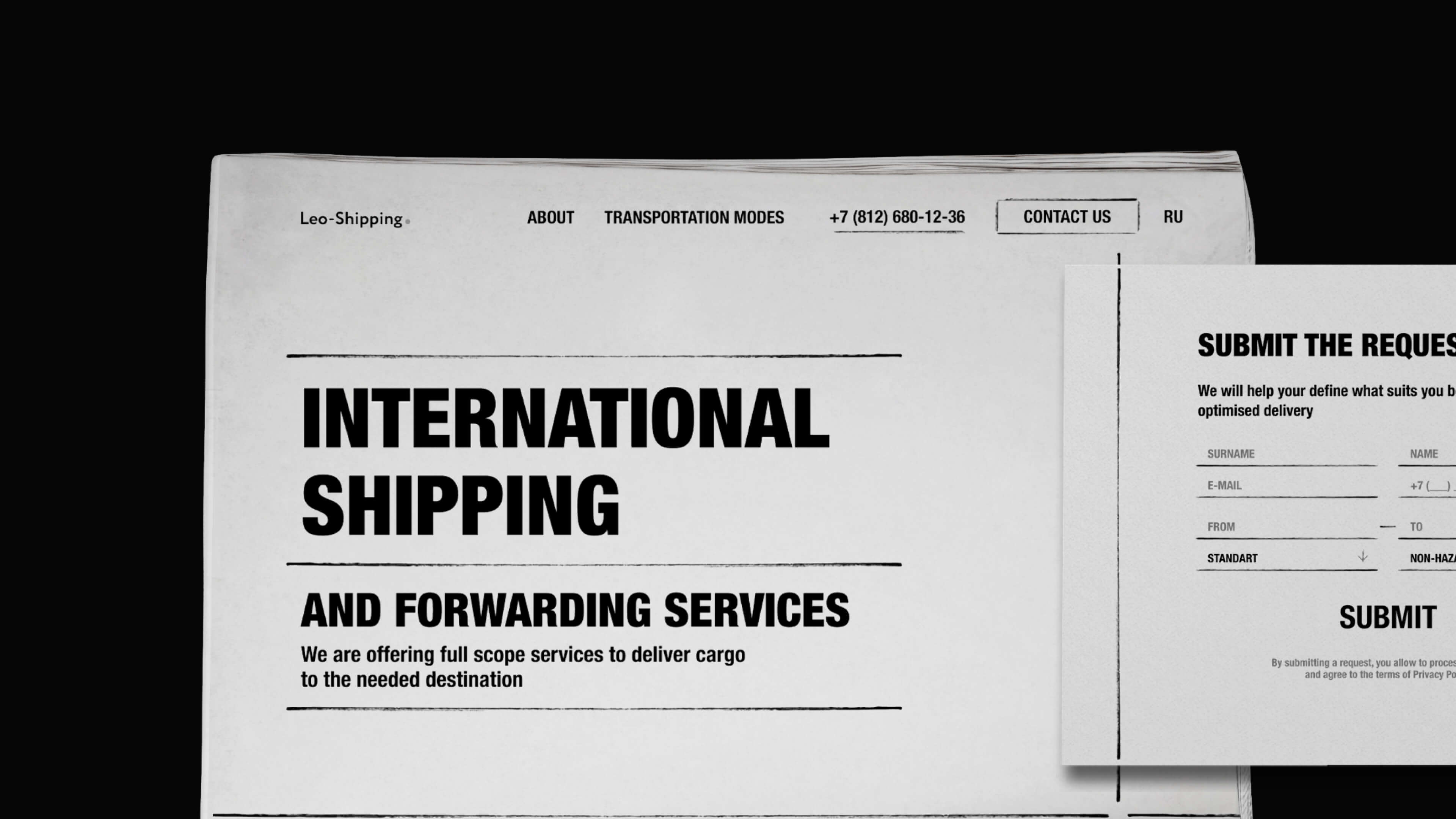
Web-design, Motion design, UI/UX
Figma, Adobe Photoshop, HTML, CSS
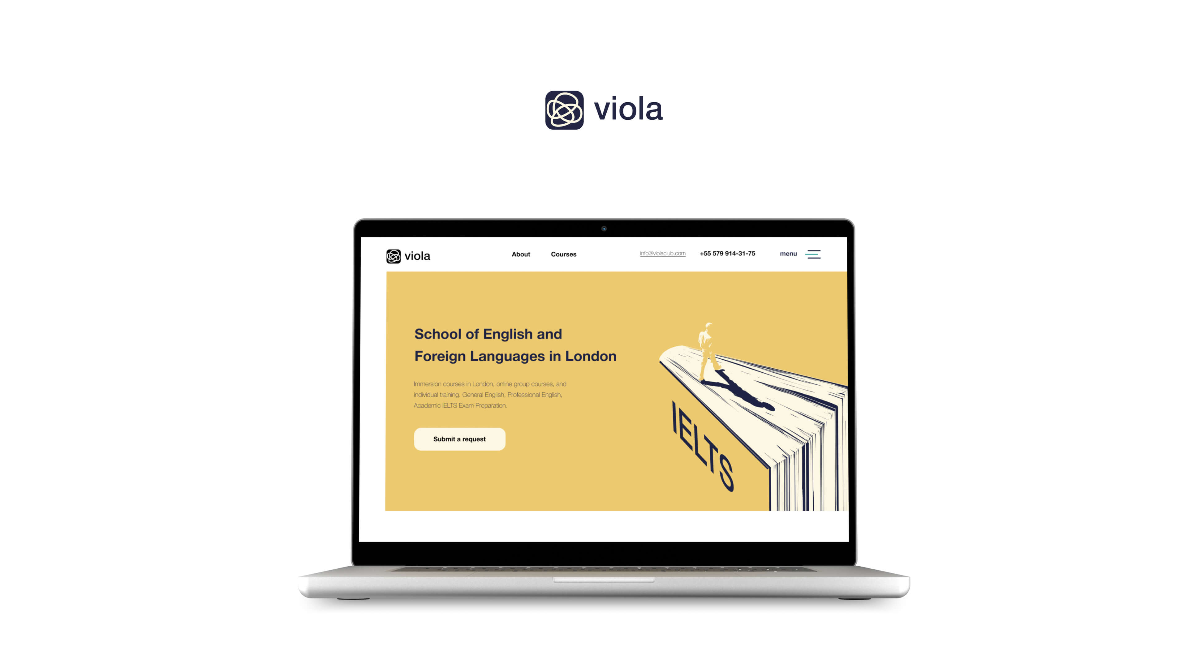
Viola Web Redesign
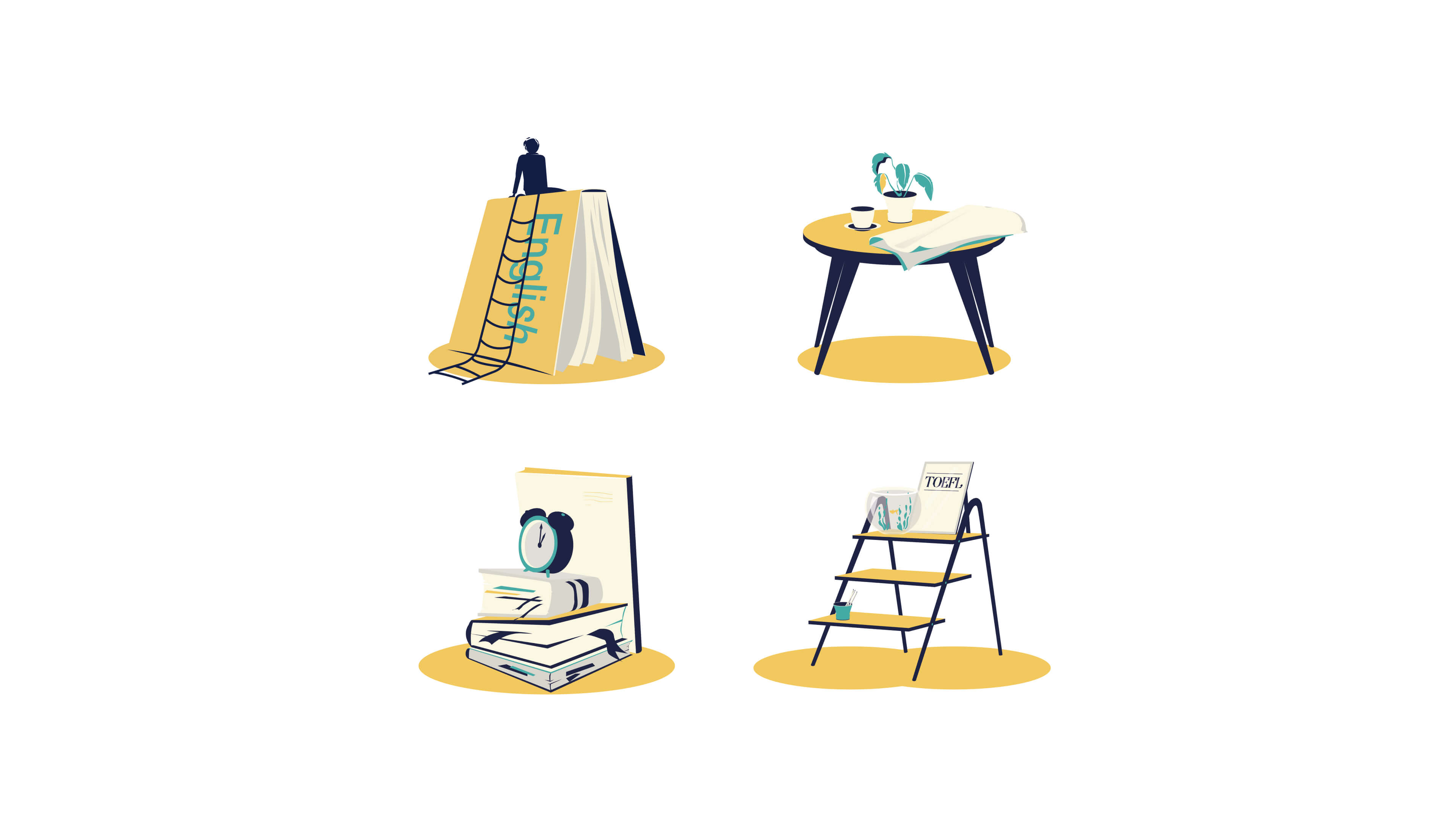
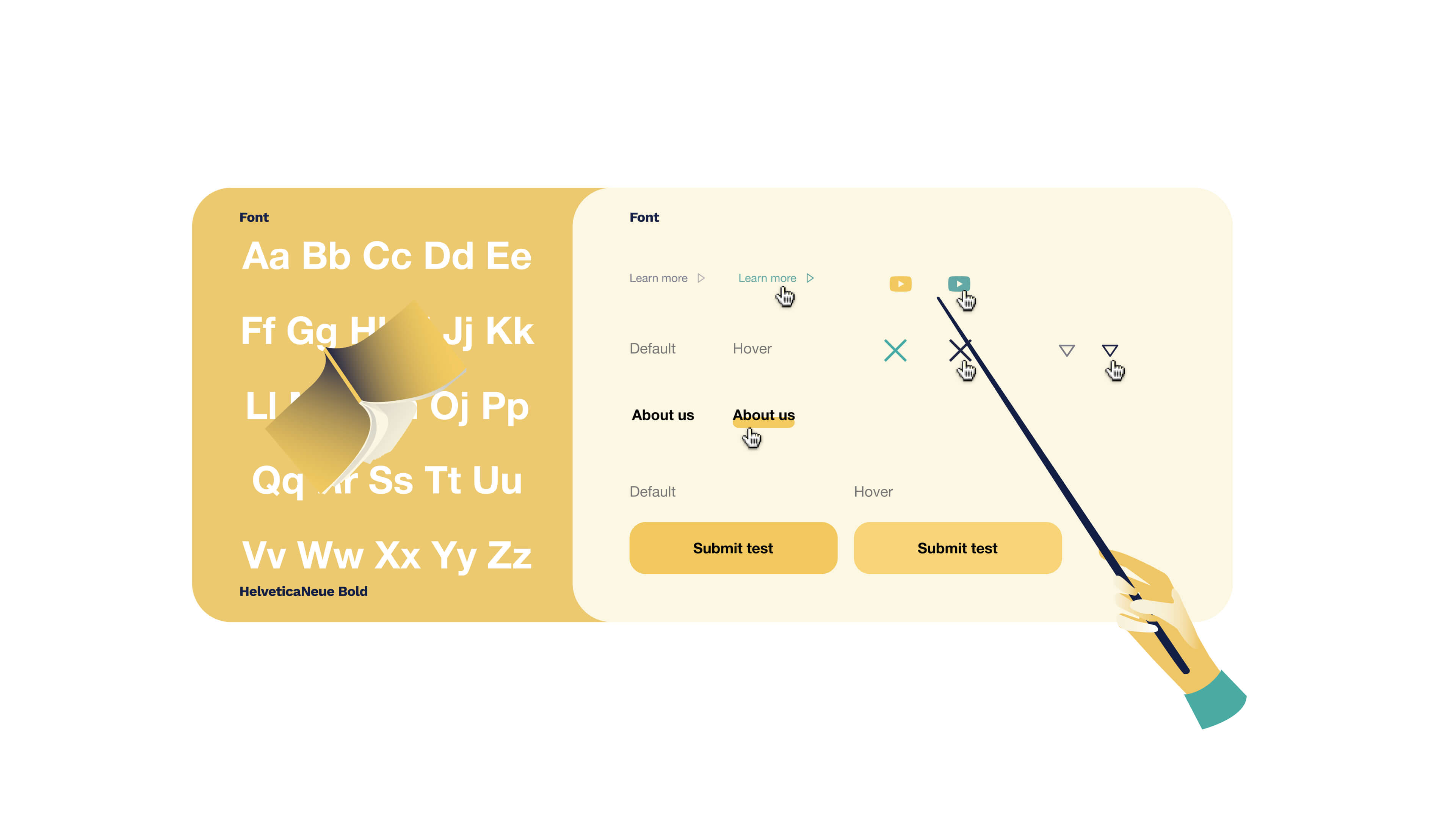
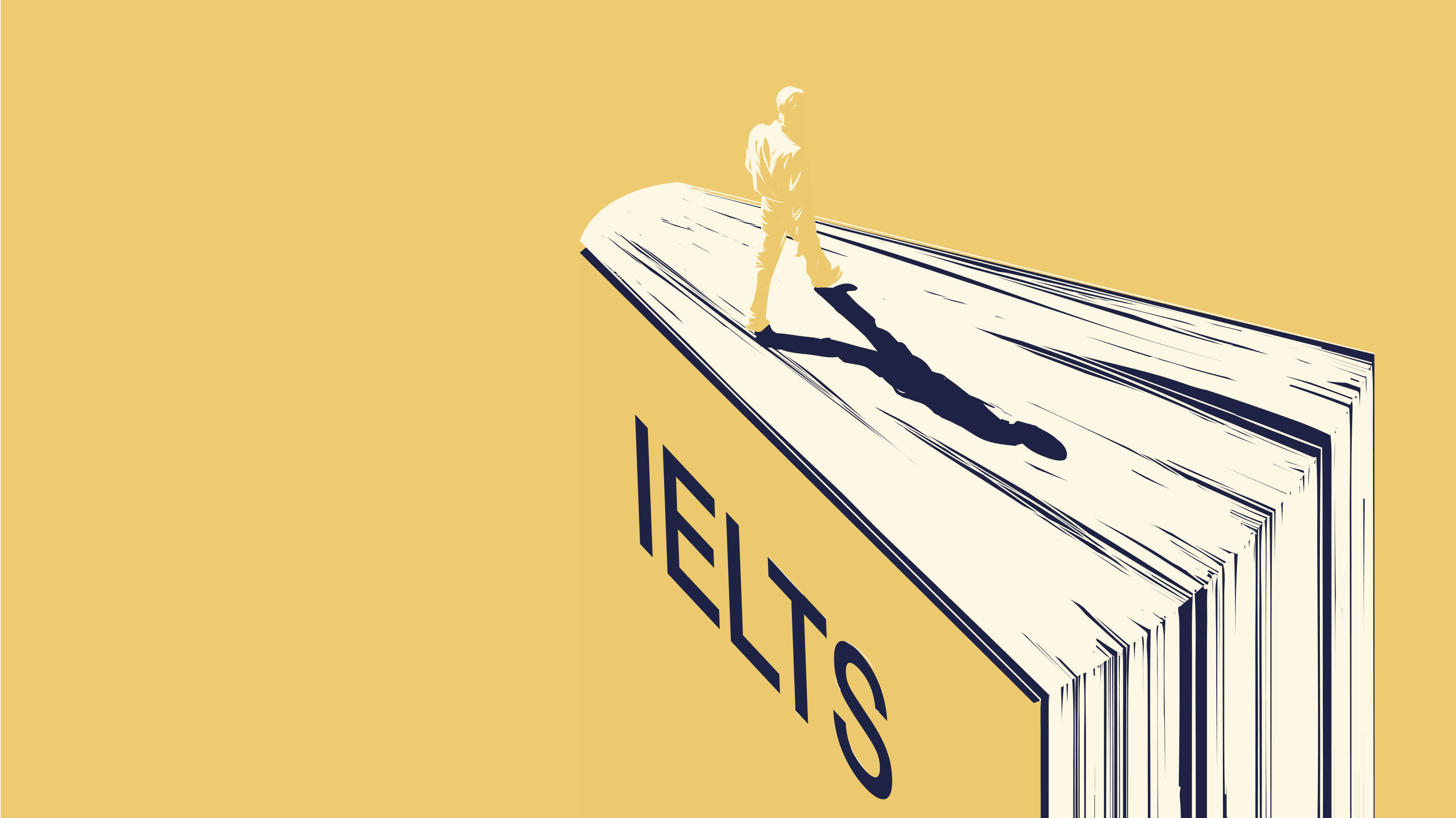
Website redesign with custom illustrations for the international English school
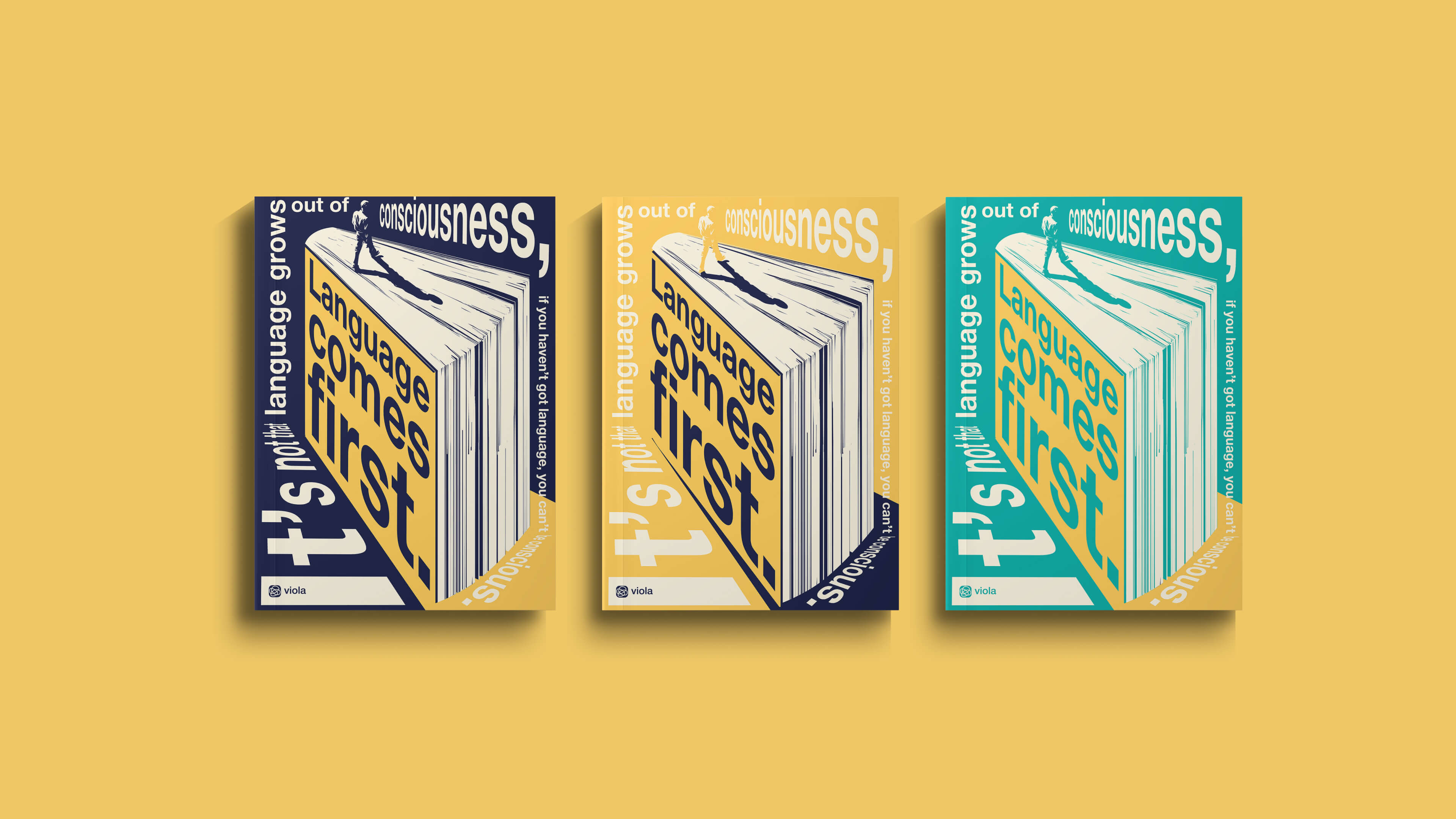
Web-development, Web-design, Motion design
Figma, Illustrator, AfterEffects, HTML, CSS
Work with us
Make it fast!
instructions_and_conditions.txtExpress design is a faster and cheaper alternative for small businesses to full-scale projects with one simple rule: no edits or comments. This way, we can cut out all the project management and focus just on the design processes. Fast execution without any quality compromises.

